LOGOTYPE
Our logotype is the most important identity asset and, as such, should always be treated with respect. It's form is soft and friendly which informs our overall visual language. Leo’s logotype must appear on all official communication.
Download LOGO-PACK
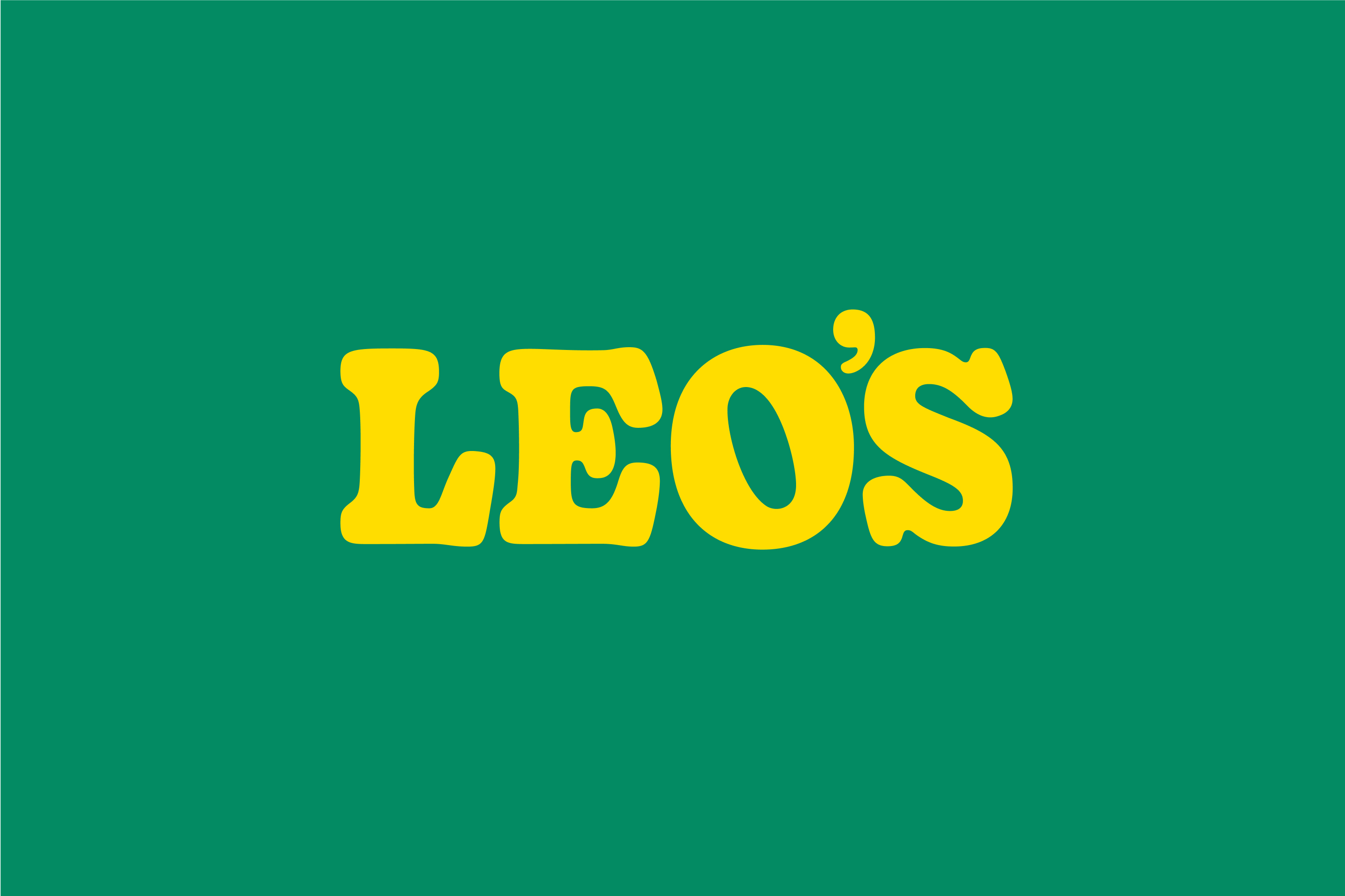
Primary use of Logotype - Yellow on deep jungle green
Primary use of Logotype - Yellow on deep jungle green
PRIMARY USAGE OF LOGOTYPE
Our logotype comes in different setups dependent on background used. We use yellow logo when used on images. Always make sure the contrast is good between the logo and the background.
Yellow on Deep jungle green
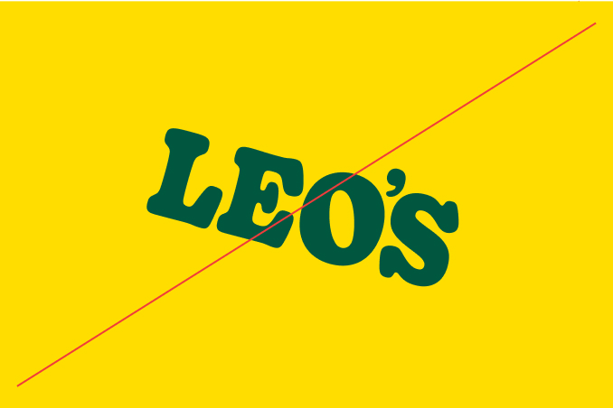
Deep jungle green on yellow backgrounds
Yellow on Jungle green
Jungle green on white backgrounds
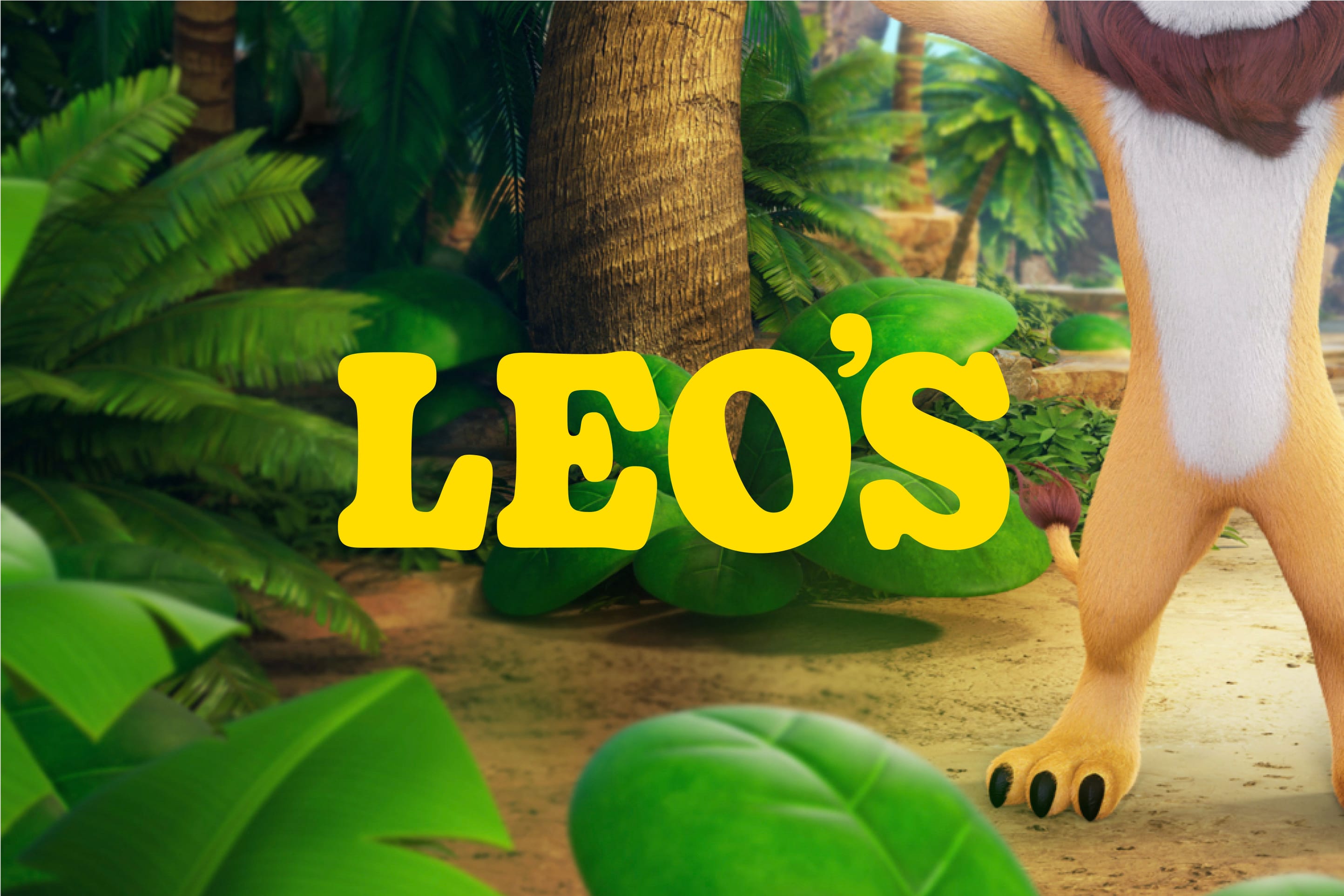
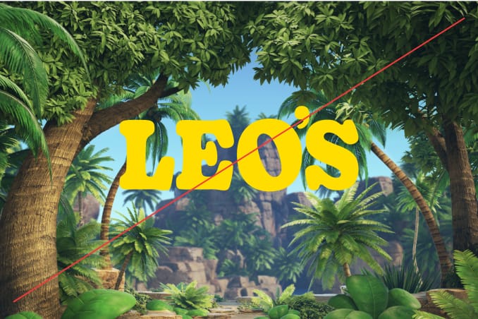
Use Yellow on 3D-images. Make sure the logo is not on a busy place.
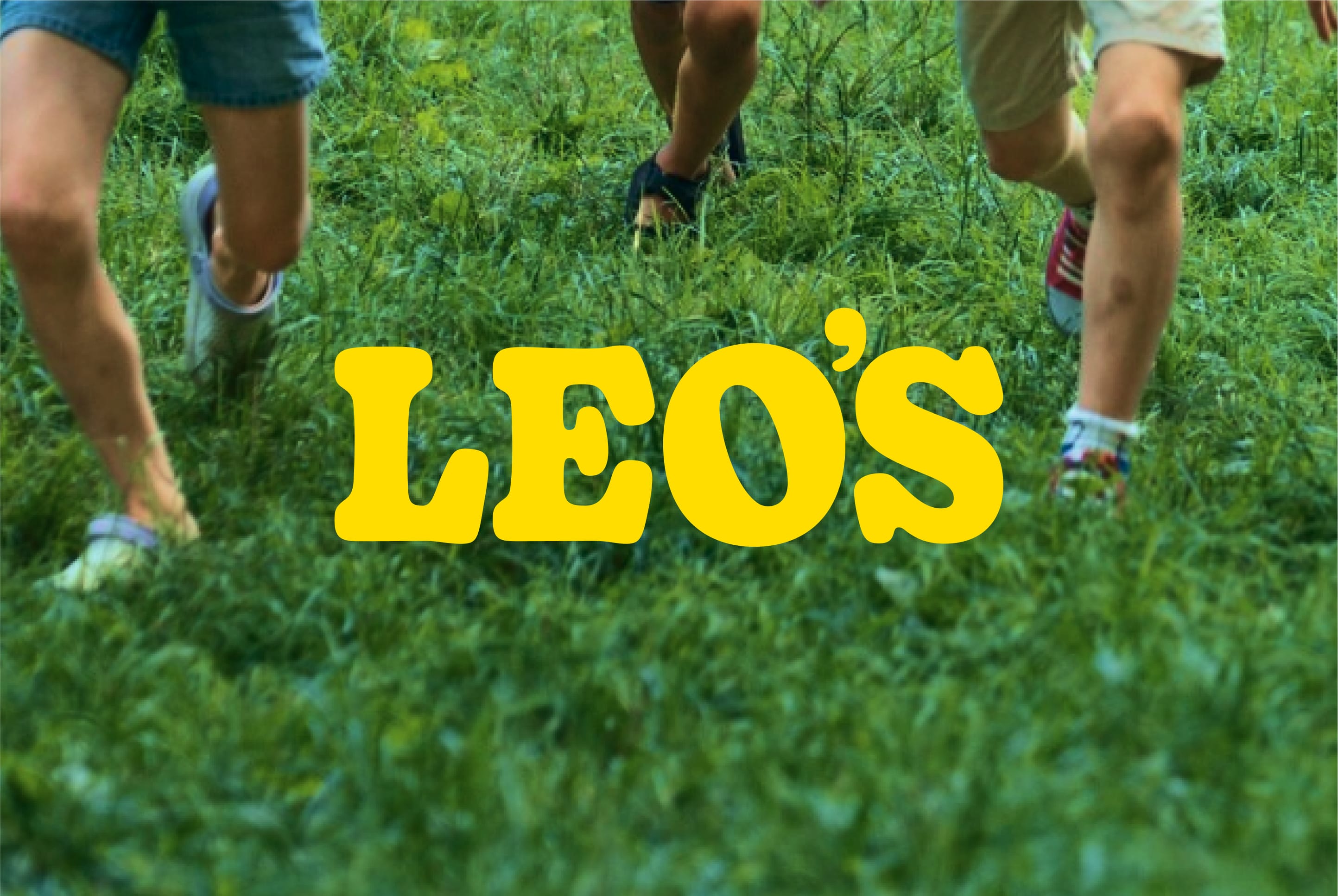
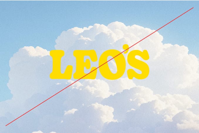
Use Yellow on images. Make sure the logo is not on a busy place.
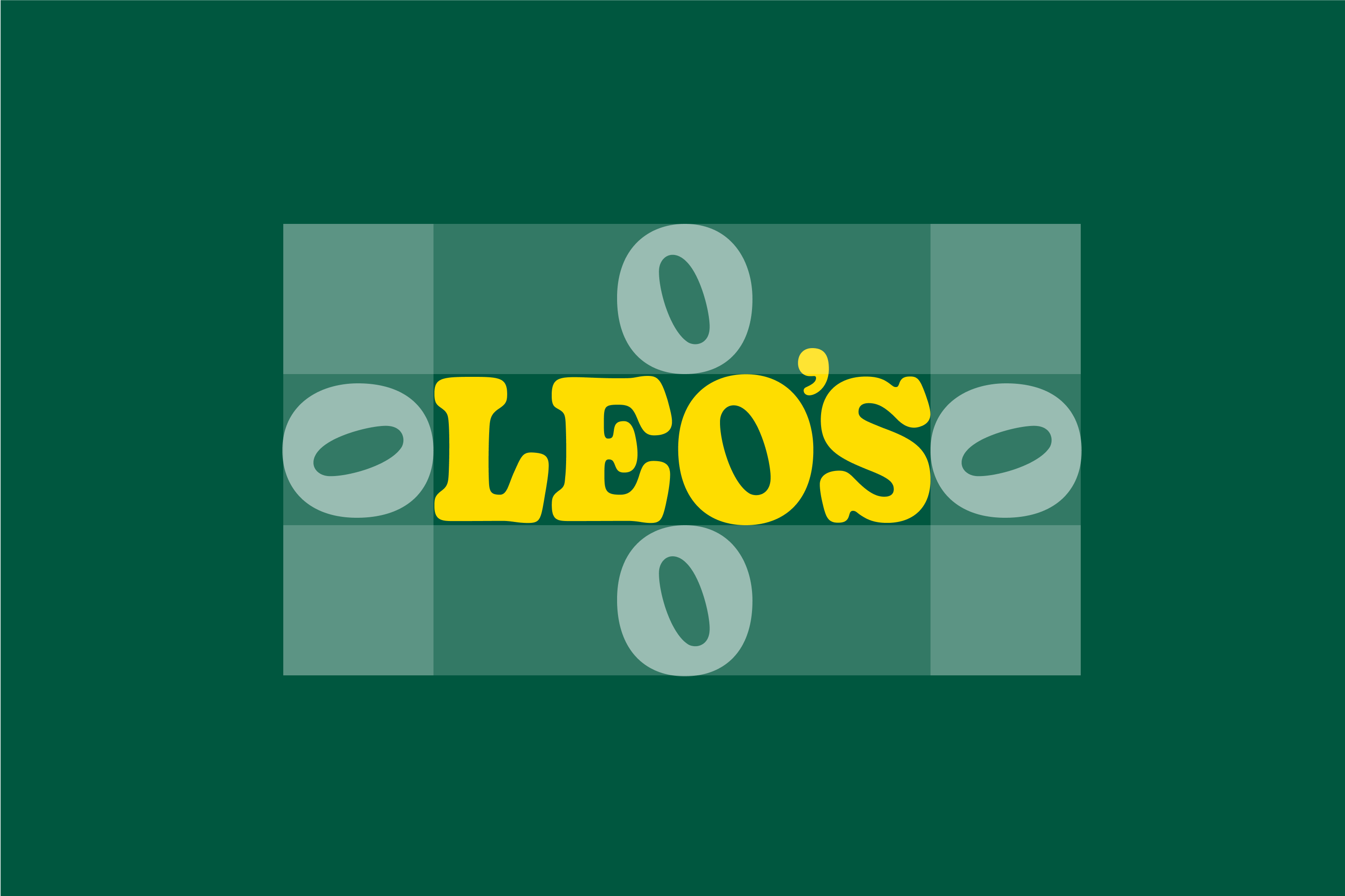
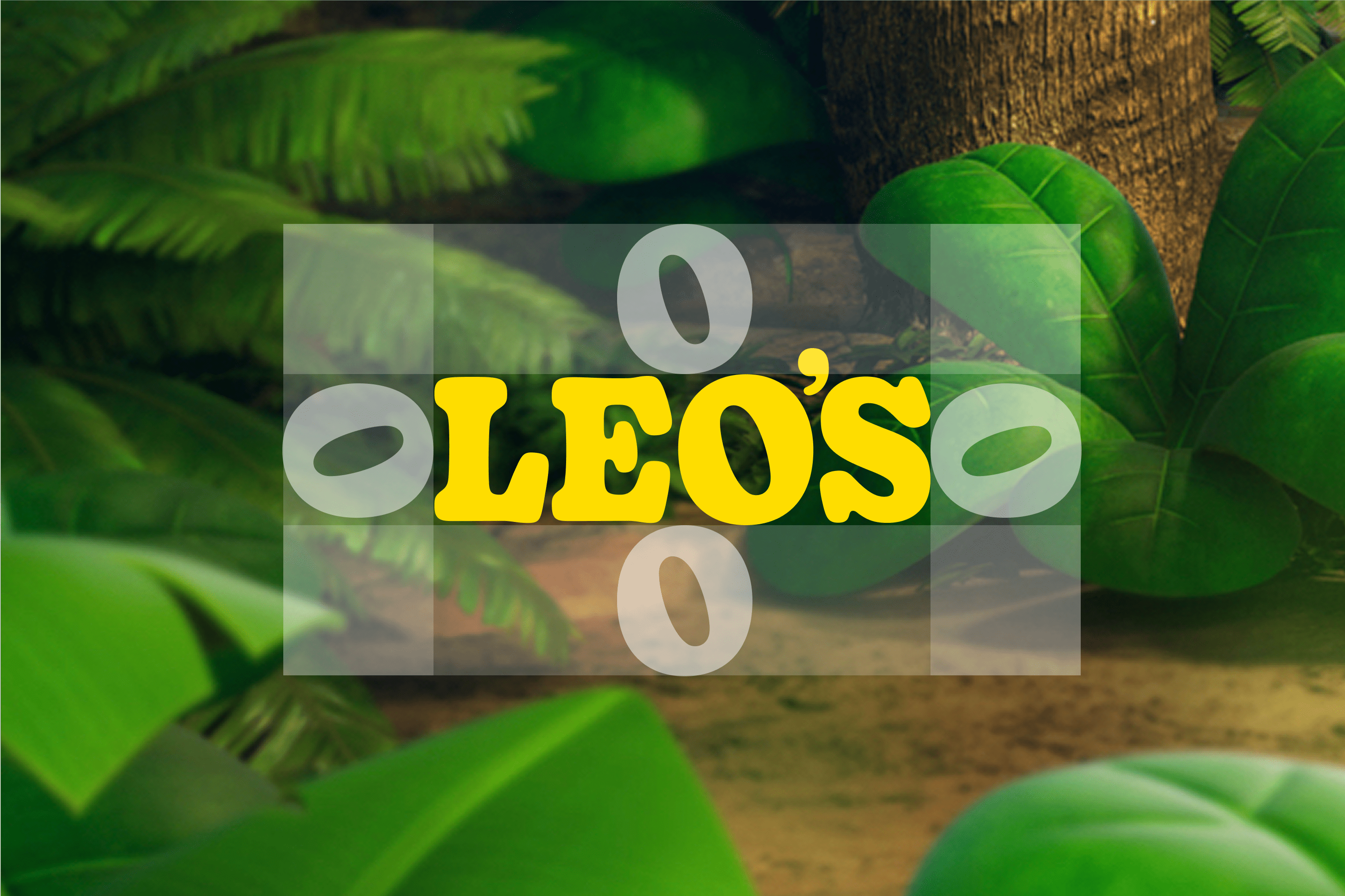
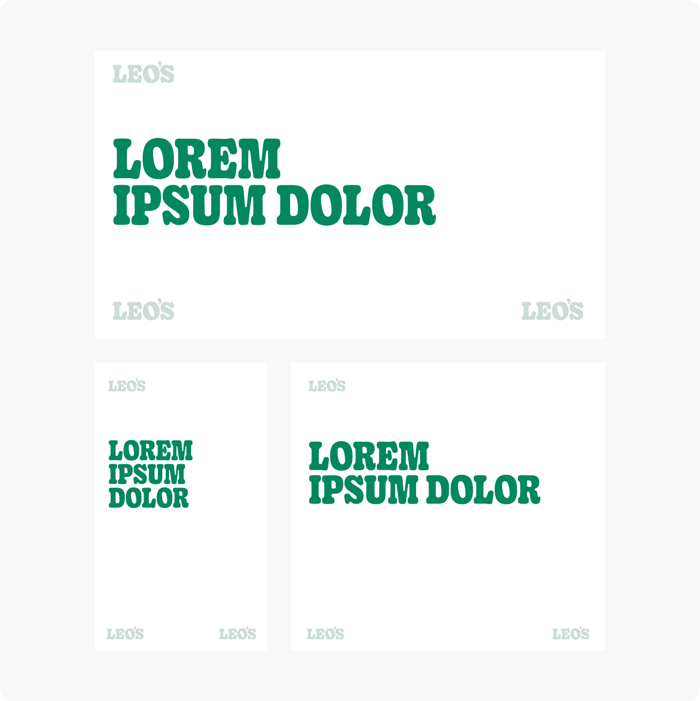
LOGO Clearspace
Clearspace is the minimum distance between the logo and other visual and verbal elements. The hight of our “O” in Leo´s defines the minimum clearspace surrounding the logo.
Clearspace with a colored background
Clearspace on image
LOGO size & position
This illustrates a general approach. Always consider information hierarchy and desired exposure of Leo’s as a sender.
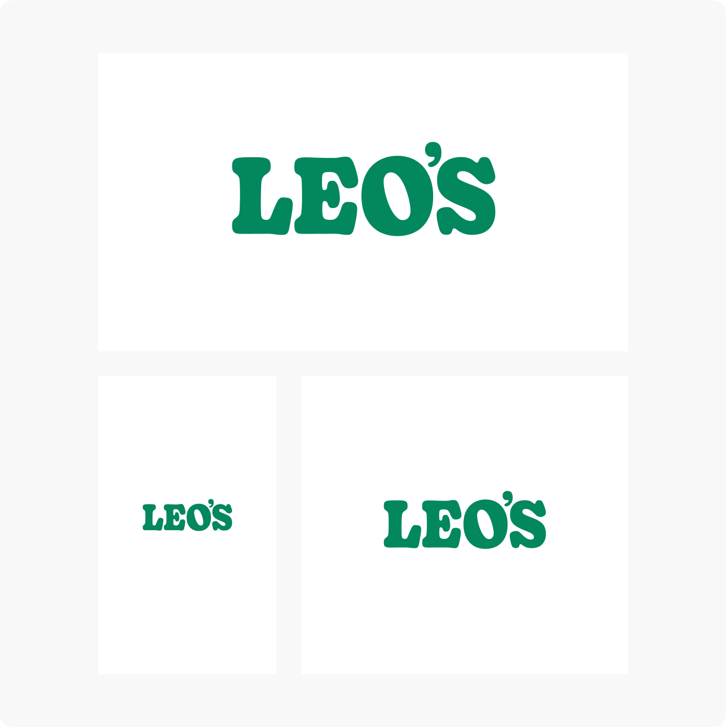
Standalone (50% of format width)
In layout
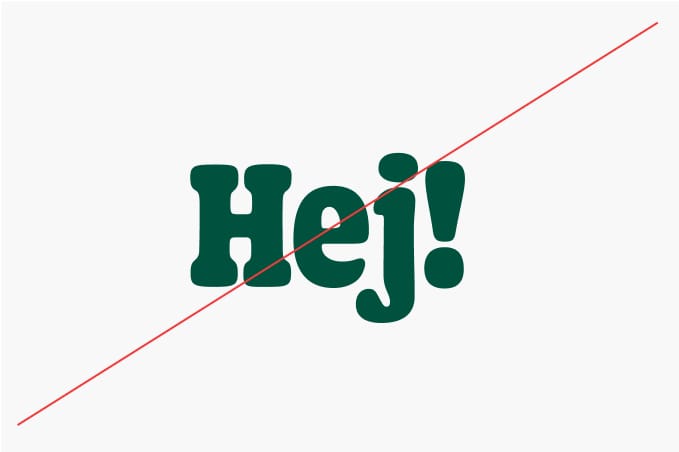
LOGOS DON'TS
It is important that we are consistent with our logotype throughout our visual identity, and that we do not modify them or use them in off-brand ways. To illustrate this point, some of the more likely mistakes are shown in this section.
Only use color versions according to our guidelines.
Don’t stretch or alter the proportions.
Do not add outlines or other effects to the logotype.
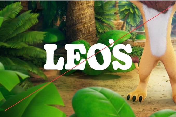
always use the yellow logotype on top of imagery
Make sure the logo is not placed on busy backgrounds of images.
Always consider enough color contrast.
Don´t use yellow logo on white or colors with not enough contrast.
Don´t tilt our logo
PAYOFF
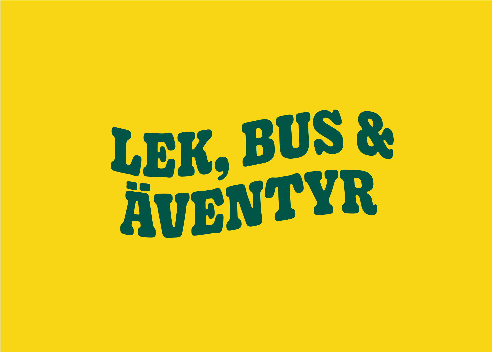
Our payoff are separated from the logotype. Depending on context, it can be written out in our playful wavy style. Perfect on new markets when we need to establish our offering.
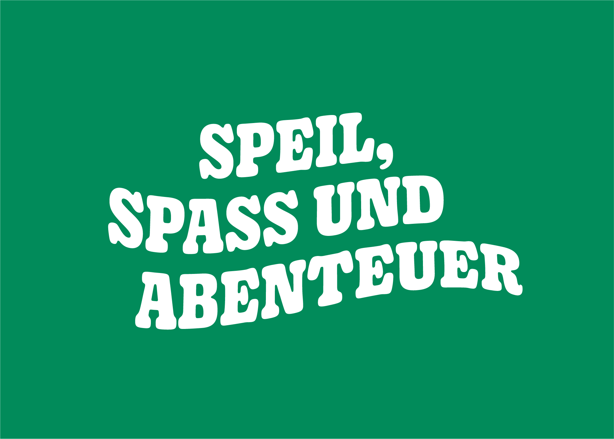
Wavy and fun - German payoff
Wavy and fun - English payoff
Wavy and fun - Swedish payoff
EXAMPLE OF USAGE
Our wavy style works nice and looks fun and quirky close to the logotype on facades.
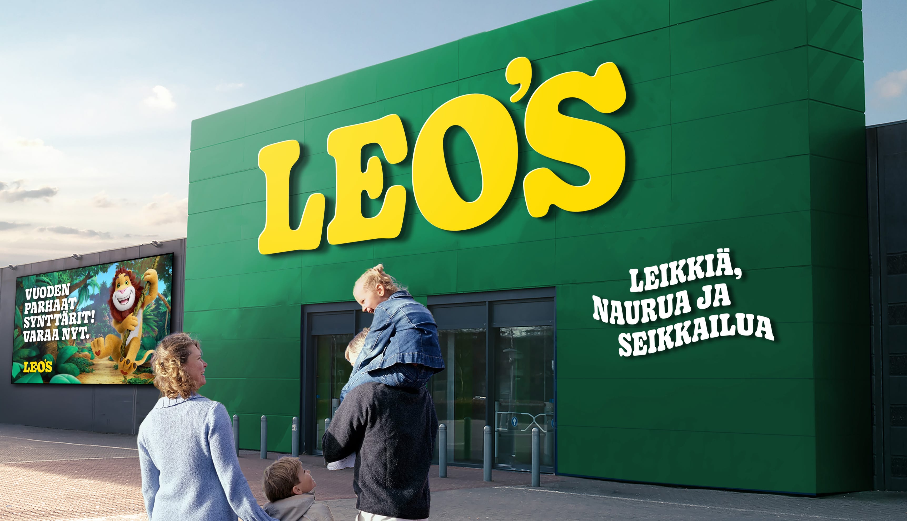
Entrance section in upcoming facility in germany
COLORS
Color is an immediate tool to signal our brand and distinguish from competitors. Our color palette also helps convey that the jungle is a central theme for Leo’s.
PRIMARY COLORS
Leo´s is a green and yellow brand. In all external communication we will be green and yellow. This is our core brand colors and is used most frequently.
DEEP JUNGLE GREEN
HEX: #115740
CMYK: 80, 10, 60, 60
PMS: 343 C
RAL: 6005
NCS: S 6030-B90G
JUNGLE GREEN
HEX: #038B62
CMYK: 90, 10, 70, 30
PMS: 341 C
NCS: S 3060-G
SUNNY YELLOW
HEX: #FEDD00
CMYK: 0, 10, 90, 0
PMS: 108 C
RAL: 1018
Secondary colors
The brown palette is our secondary colors since is closely associated with wood and jungle themed adventure parks. The secondary palette is used as complementary/supporting colors
DARK BROWN
HEX: #4E3629
CMYK: 45, 60, 70, 65
PMS: 2322 C / 2322 U
-
BROWN
HEX: #774E31
CMYK: 35, 60, 75, 45
PMS: 7512 C - 7512 U
-
LIGHT BROWN
HEX: #ECDAC7
CMYK: 10, 15, 20, 0
PMS: 482 C
-
EGGSHELL BROWN
HEX: #F6F4E8
CMYK: 5, 3, 11, 0
-
-
MID GREEN
HEX: #4FA589
CMYK: 65, 0, 50, 15
-
LIGHT GREEN
HEX: #A1E0C1
CMYK: 40, 0, 30, 0
PMS: 337 C
-
SUPER LIGHT GREEN
HEX: #DFEFEB
CMYK: 16, 0, 10, 0
-
LIGHT YELLOW
HEX: #FFFACE
CMYK: 0, 0, 40, 0
-
tertiary colors
Our tertiary color palette is a third level of brand colors, used more sparingly and with specific purposes in mind. The tertiary color palette is optional, extended colors for special use cases. They can be used for comunicating different flavors, limited editions, or thematic zones at the play centers.
DARK BLUE
HEX: #003464
CMYK: 100, 90, 30, 20
PMS: 302 C
-
BLUE
HEX: #0f61b6
CMYK: 90, 65, 0, 0
PMS: 300 C
-
MID BLUE
HEX: #8fd1e5
CMYK: 50, 0, 10, 0
PMS: XXXX C
-
LIGHT BLUE
HEX: #cae8f3
CMYK: 25, 0, 5, 0
PMS: 7457 C
-
DARK RED
HEX: #7f1718
CMYK: 30, 100, 90, 40
PMS: 1807 C
-
RED
HEX: #e40425
CMYK: 0, 100, 80, 10
PMS: 2035 C
-
MID RED(PINK)
HEX: #f7bdc3
CMYK: 0, 35, 15, 0
-
-
LIGHT PINK
HEX: #ffeceb
CMYK: 0, 15, 5, 0
-
-
ORANGE
HEX: #FF5100
CMYK: 0, 70, 90, 0
PMS: 021 C
-
MID ORANGE
HEX: #f29269
CMYK: 0, 40, 57, 5
-
DIGITAL colors
We add a set of supporting colors to cater for variation and flexibility when it comes to digital applications.
EMERALD GREEN
HEX: #07C088
CMYK: 70, 0, 60, 0
PMS: 339 C
-
TYPOGRAPHY
Our typography is tied heavily to our logotype. Gooper is a soft and playful typeface carrying visual distinction without compromising legibility. Use the common pack. Full font pack is only to be used in specifik cases.
Download FONT-PACK COMMON USEDownload FULL FONT-PACK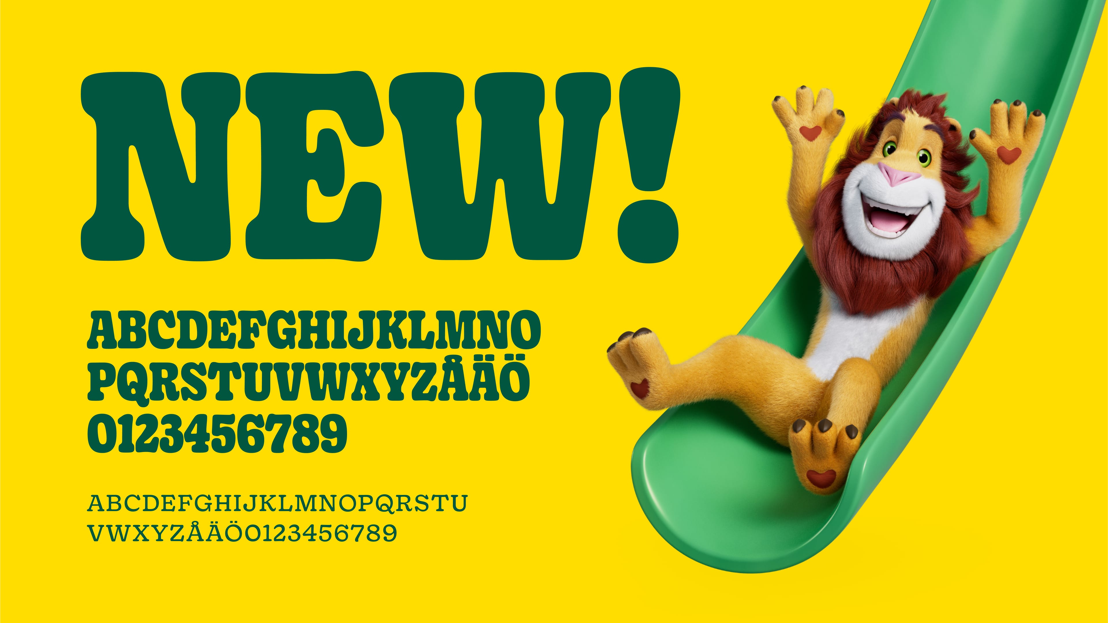
Our TYPEFACE: GOOPER
Our font Gooper is a fun, warm and quirky typeface which is a perfect match for Leo´s brand.
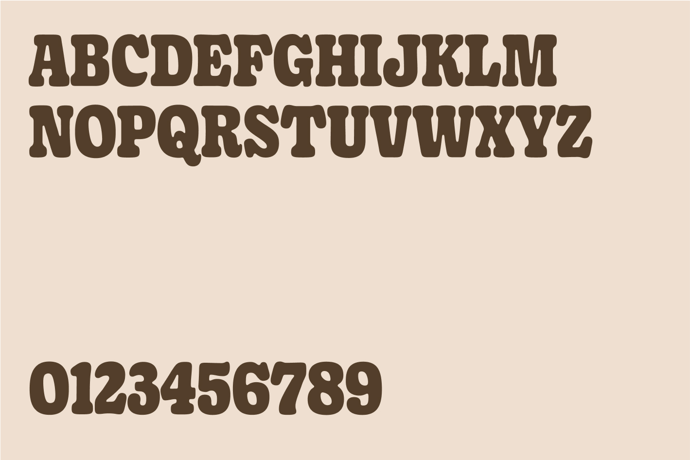
Gooper SemiCondensed Black
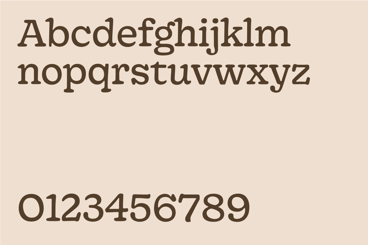
Gooper Regular
USAGE & LAYOUT
Gooper SemiCondensed Black is our primary weight and can be used in most instances, even in buttons and sub-headlines. Gooper Regular is to be used for longer texts, in smaller sizes.
Different examples of usage and layout.
TyPoGRAPHY SETTINGS & LIGATURES
Gooper’s stylistic sets and ligatures can help add flavour to typographic compositions. This should be used sparingly and with finess.
We’re not afraid to be big and bold with our messaging. Keep spacing tight and leading to
85–100%.
When working with smaller sizes, spacing may have to increase in order to retain legibility.
In body copy we use more standard settings, i.e. kerning 0 and 120–130% leading.
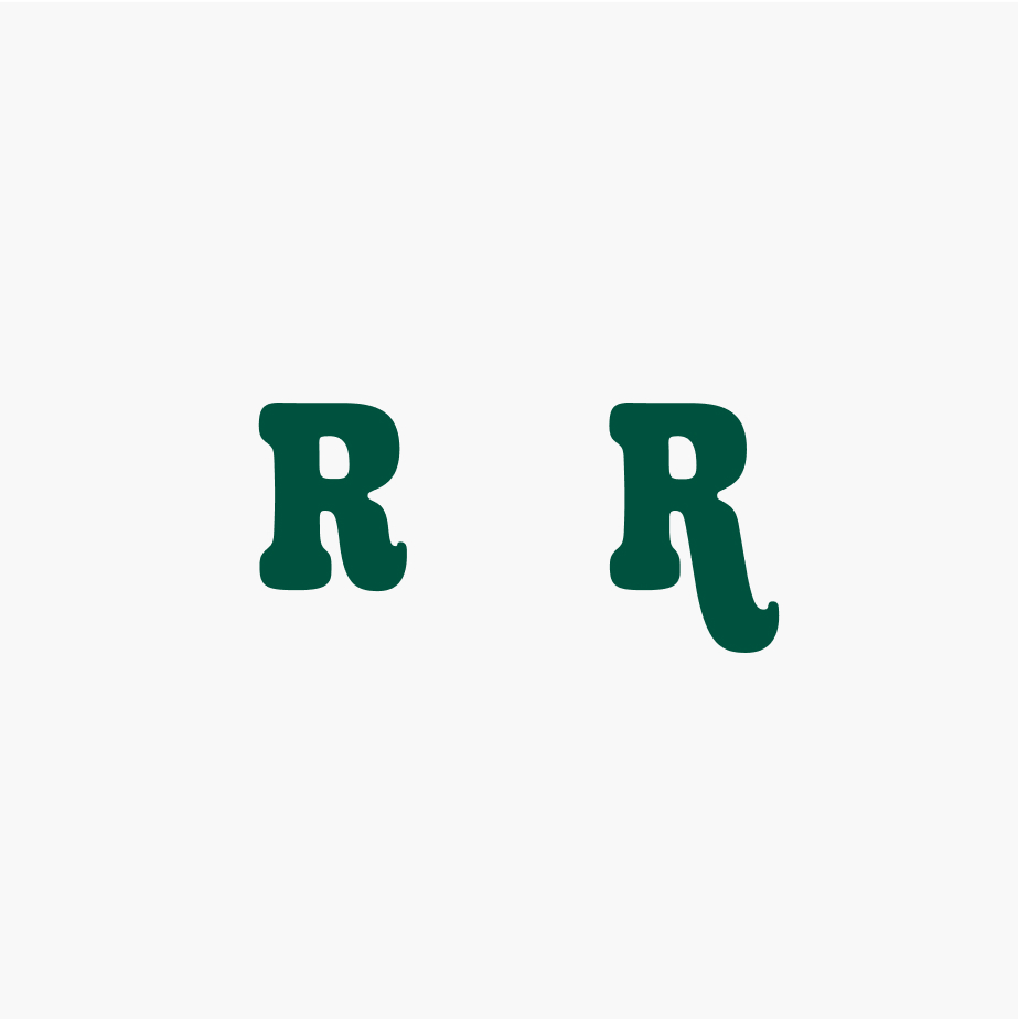
Example ligature alternativ for "R"
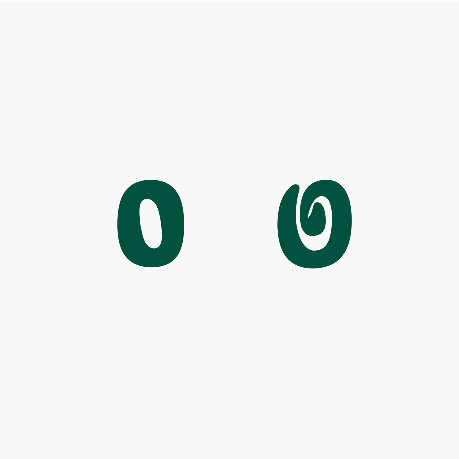
Example ligature alternativ for "O"
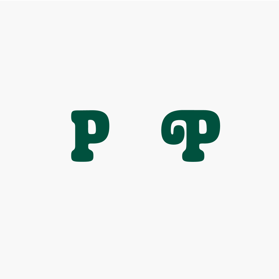
Example ligature alternativ for "P"
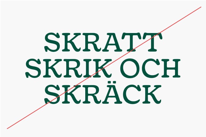
TYPOGRAPHY DONT'S
It is important that we are consistent with our typography throughout our visual identity, and that we do not modify them or use them in off-brand ways. To illustrate this point, some of the more likely mistakes are shown in this section.
Increase leading if discritics (å,ä,ö) are colliding.
Don’t use Gooper Regular for headlines or larger copy.
Centered text is harder to read – we avoid it in longer headlines or copy.
We only use our headline weight in upper case.
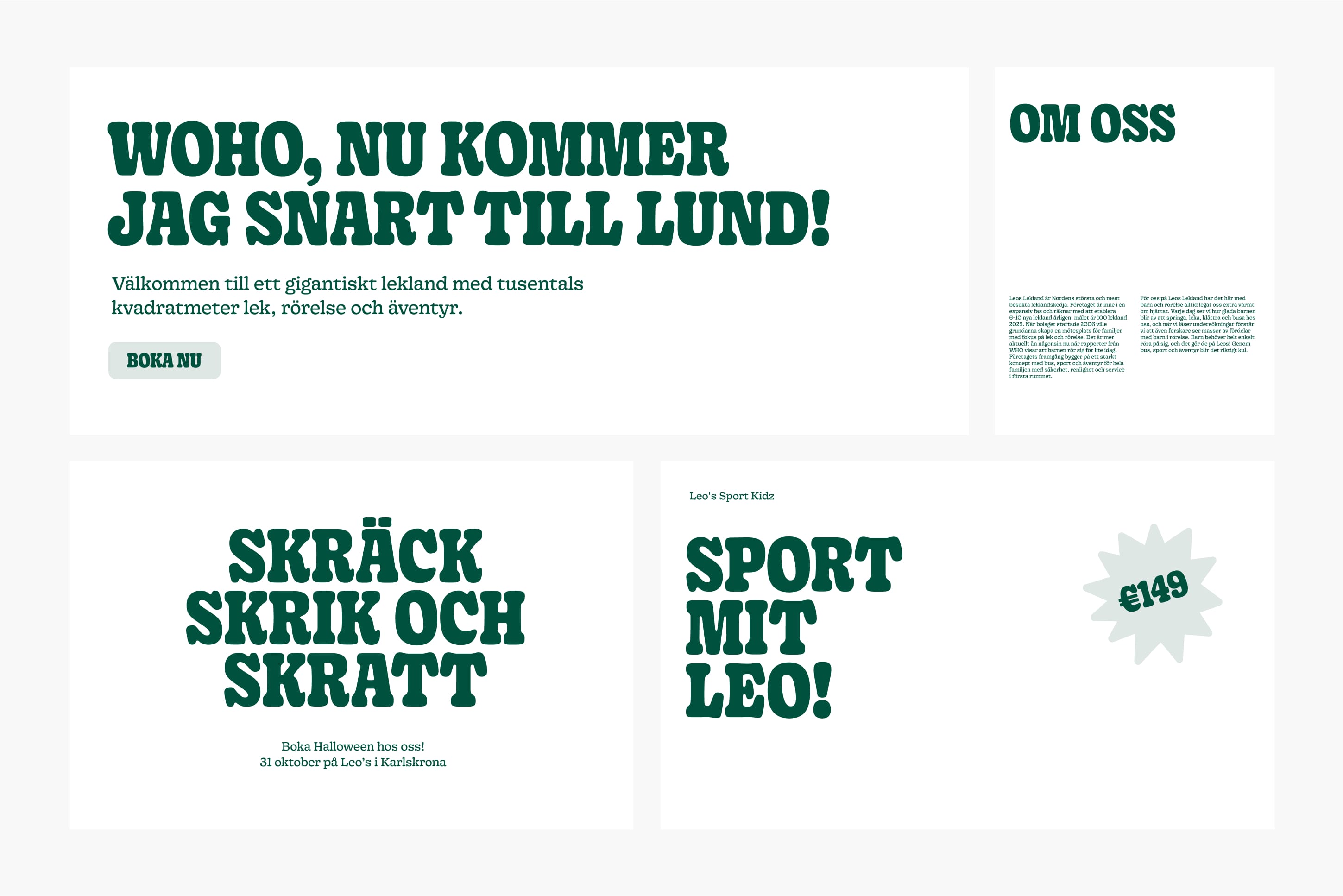
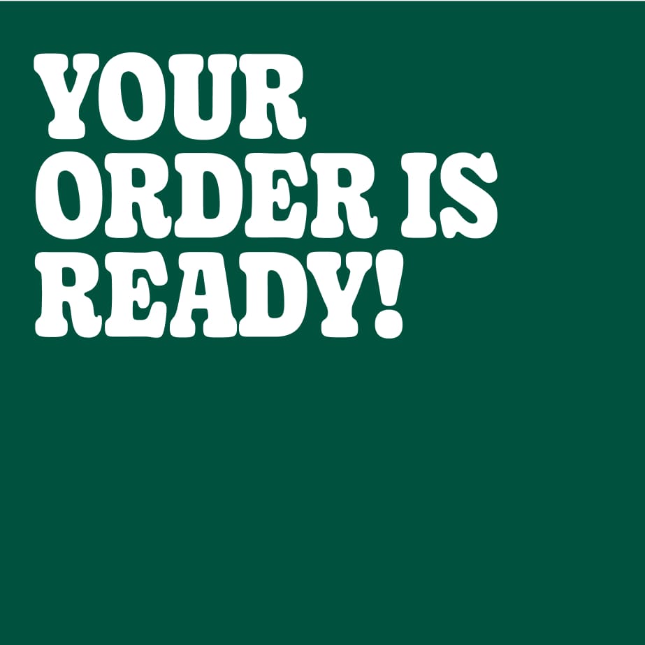
EXAMPLE OF USAGE
Examples of usage and layout.
LEO
Our Character Leo is a big part of our brand. Try to use him as often as possible. Either with the 3D backdrops or with a flat colored backdrop.
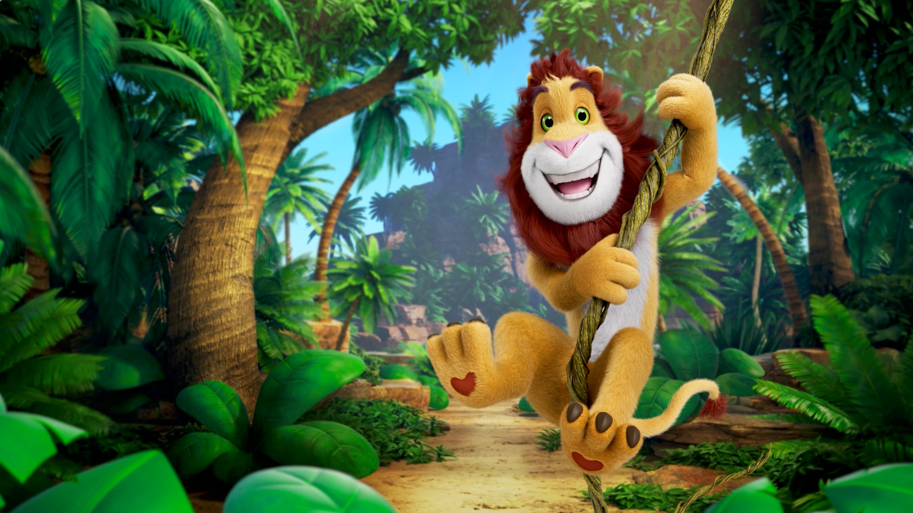
Horisontal image for use big on walls or in digital context such as banners. Leo´s home is the Jungle.
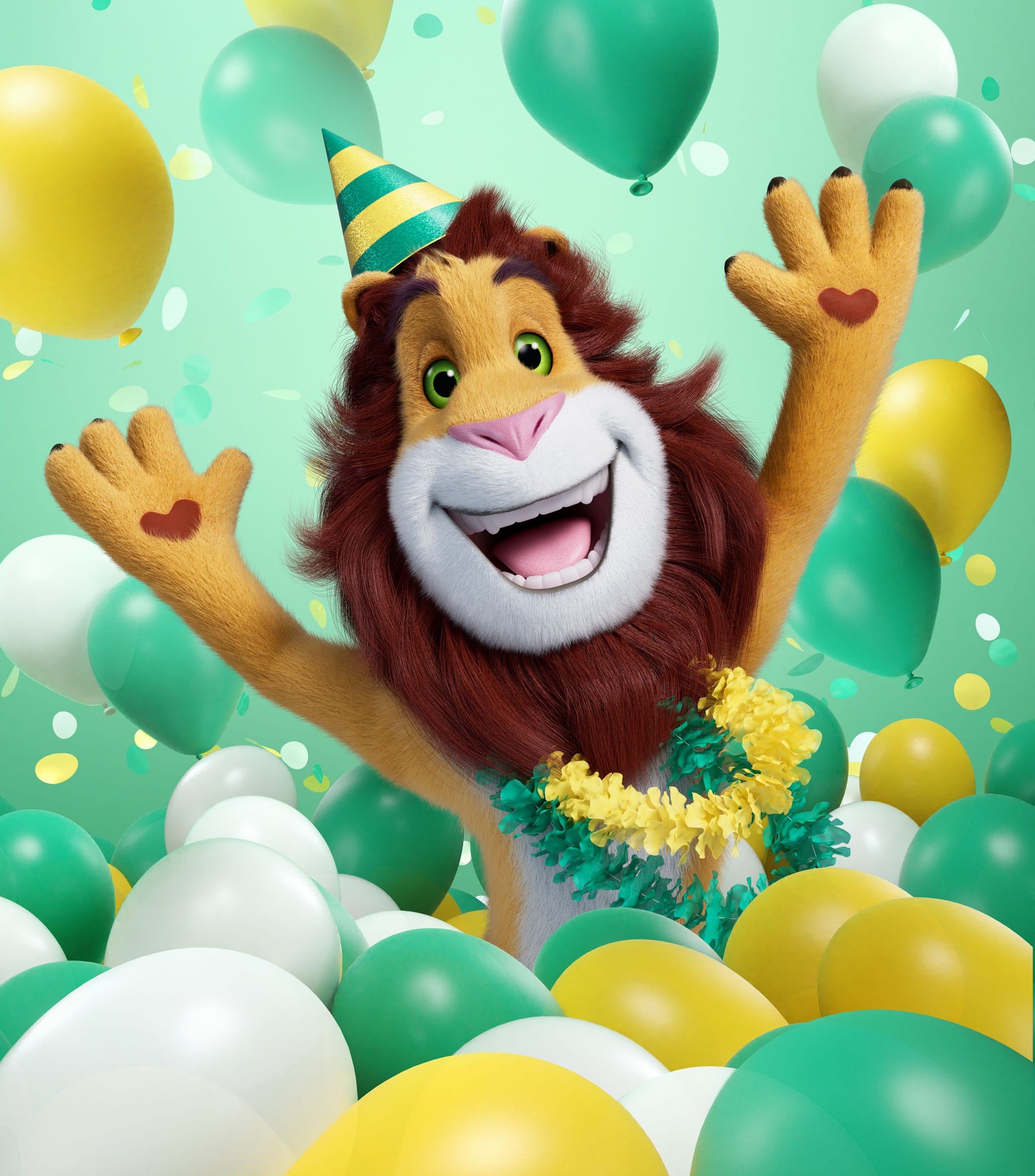
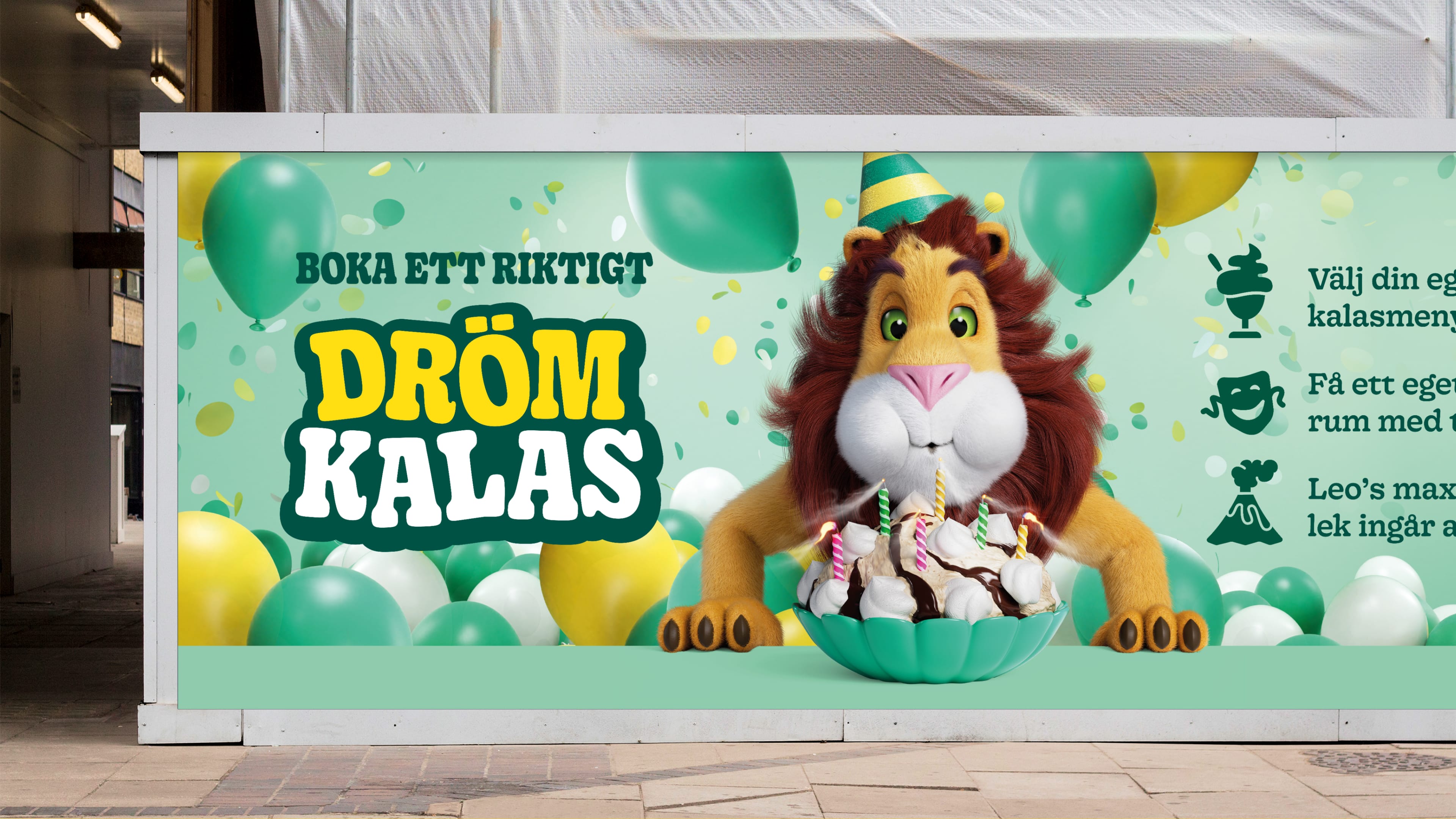
Leo with balloons. Perfect for "Dreamparty" promotions.

Leo´s head is often used alone. It´s almost as strong as the logo.
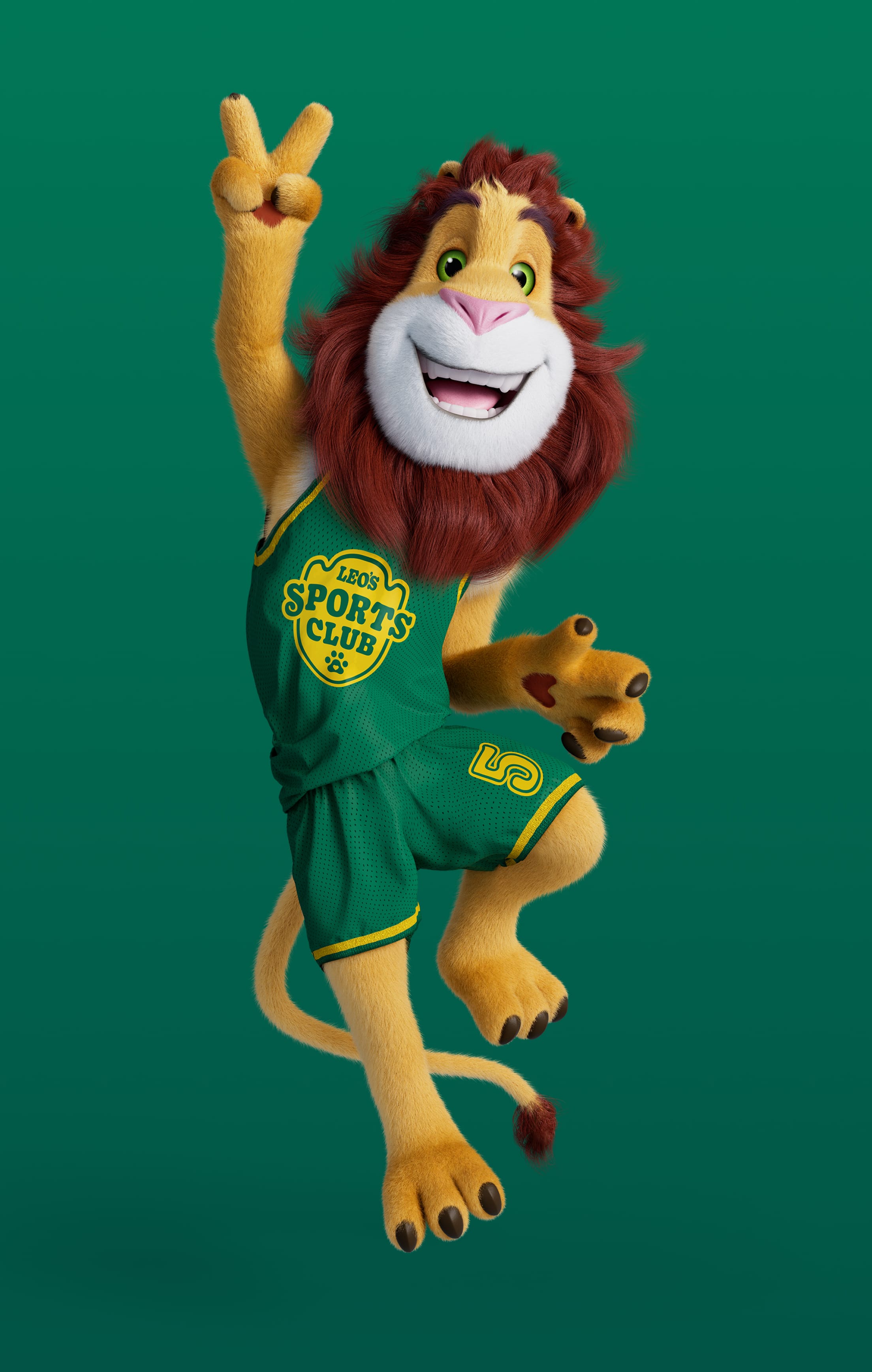
In Leo´s Sportclub he is always in his special Leo´s sports club team dress.
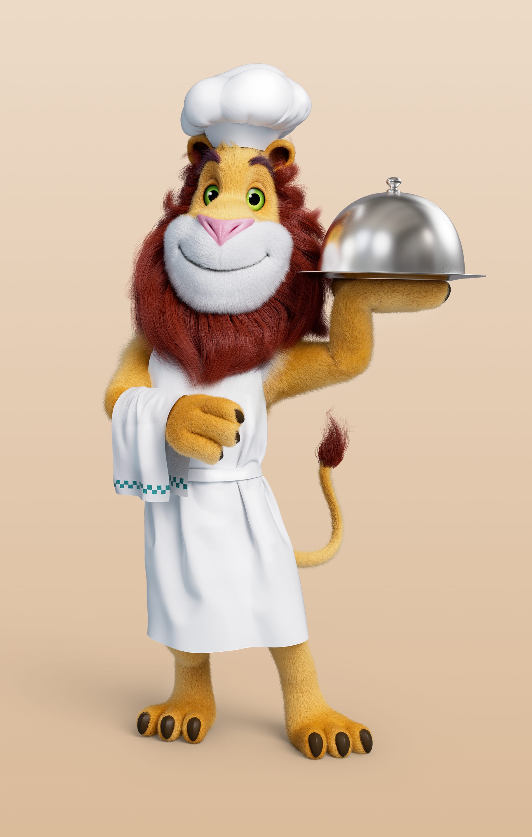
Working in the Leo´s Bistro he is of course dressed in his french bistro outfit.
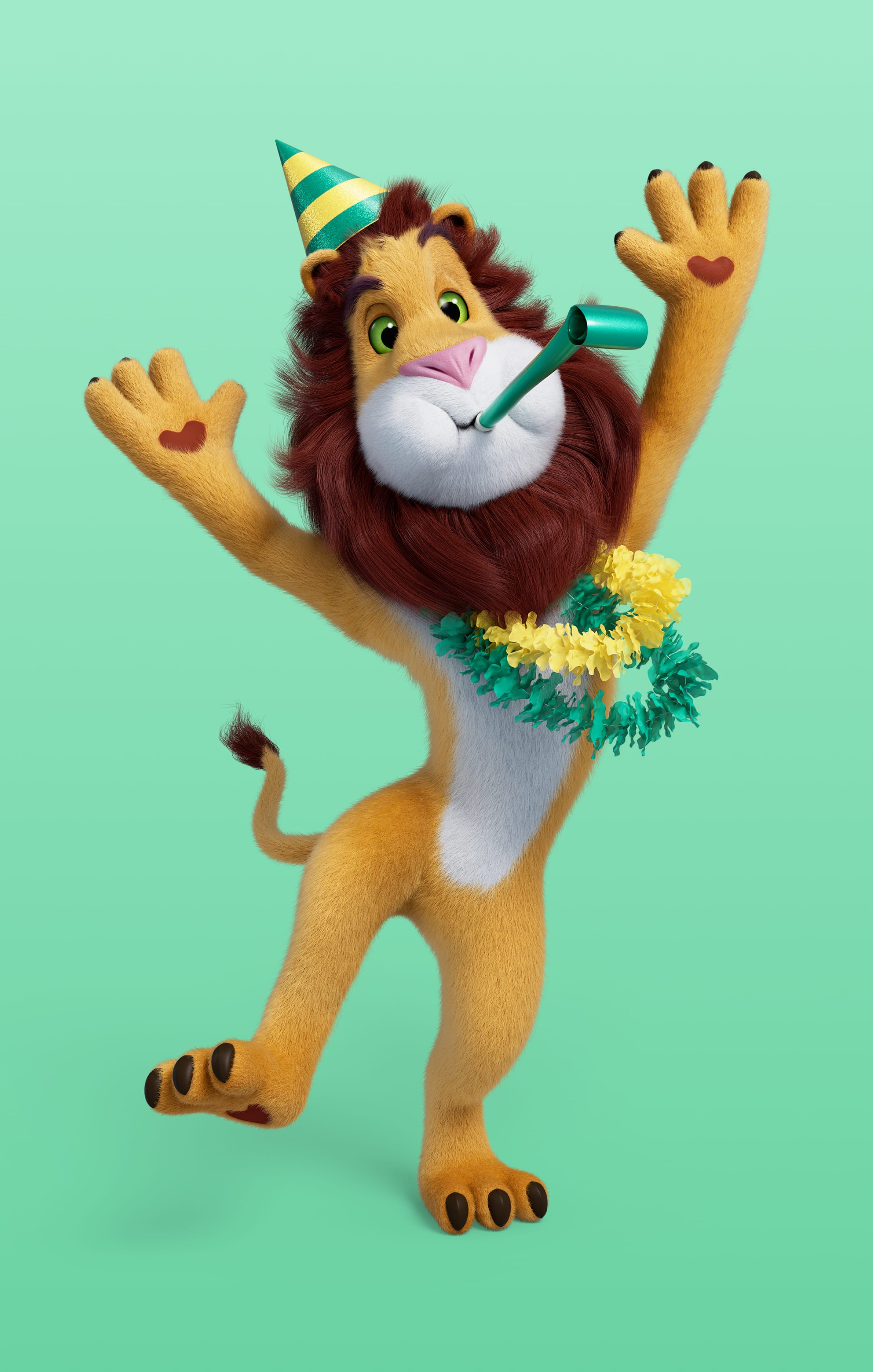
When it´s party it´s party! Hats, funny necklace and other party essentials.
EXAMPLE OF USAGE

In the subway.
In our digital flagship store.
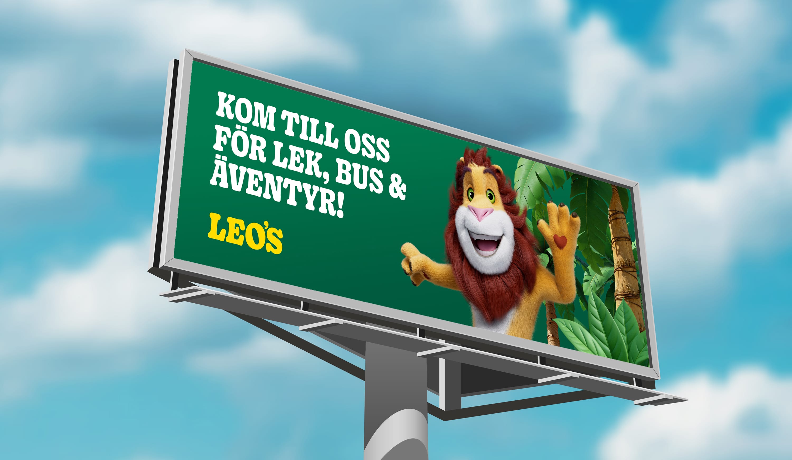
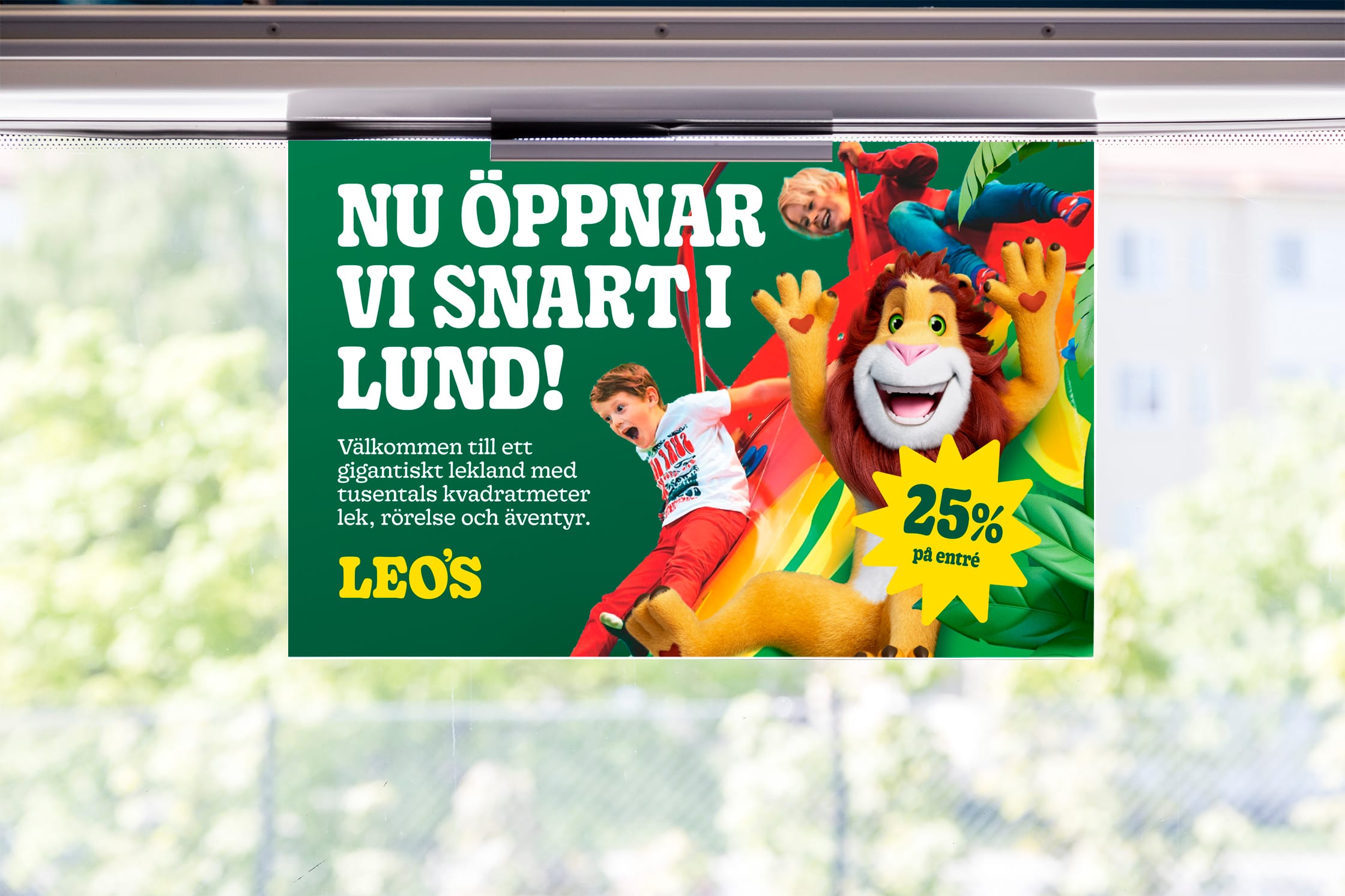
Big on streetsign promoting "Dream party"
Photography
Our image style aims to reflect our vision “Active and happy kids”. Always portray kids having a blast at Leo’s with friends or family. Try to use images with energy and movement. Use a tight crop in order to get the kids happy facial expressions.
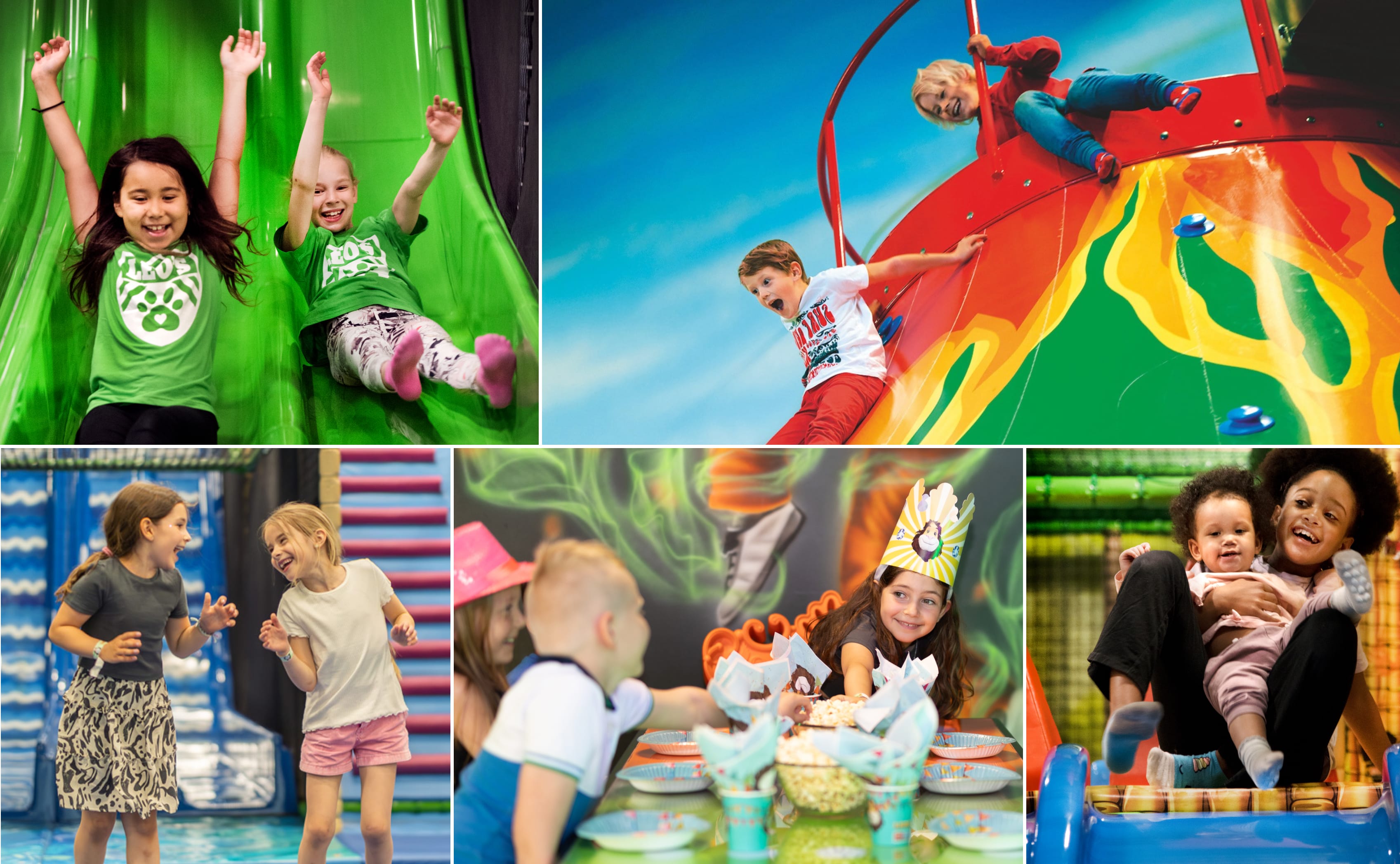
EXAMPLE OF USAGE
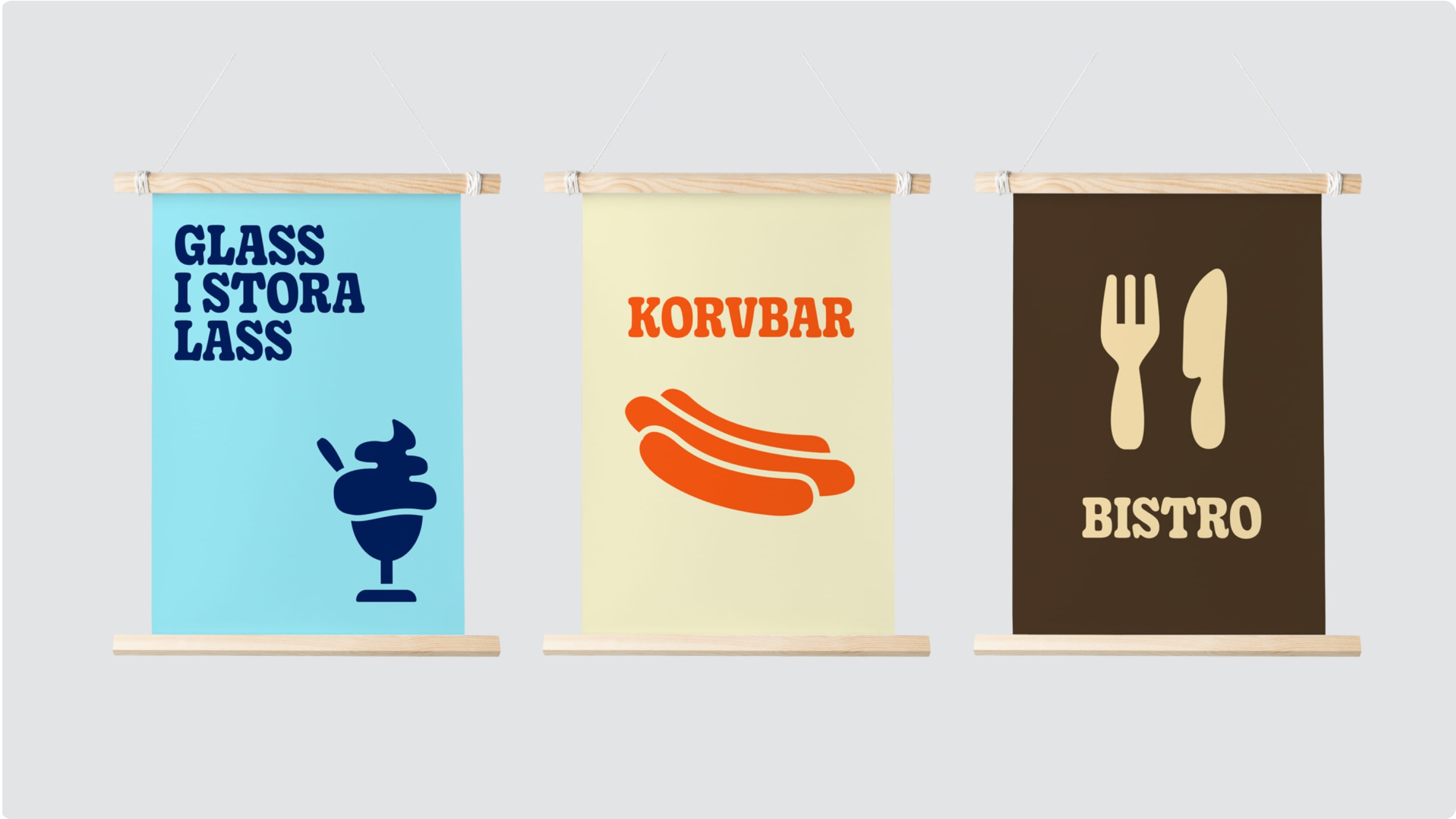
ICONS
Our icons can be used to draw attention to something, support wayfinding or as decorations. Rounded edges help harmonise their expression with our overall visual language and has a clear connection with our font Gooper. We always use filled icons and never line-art icons.
Download Icon-pack (EPS)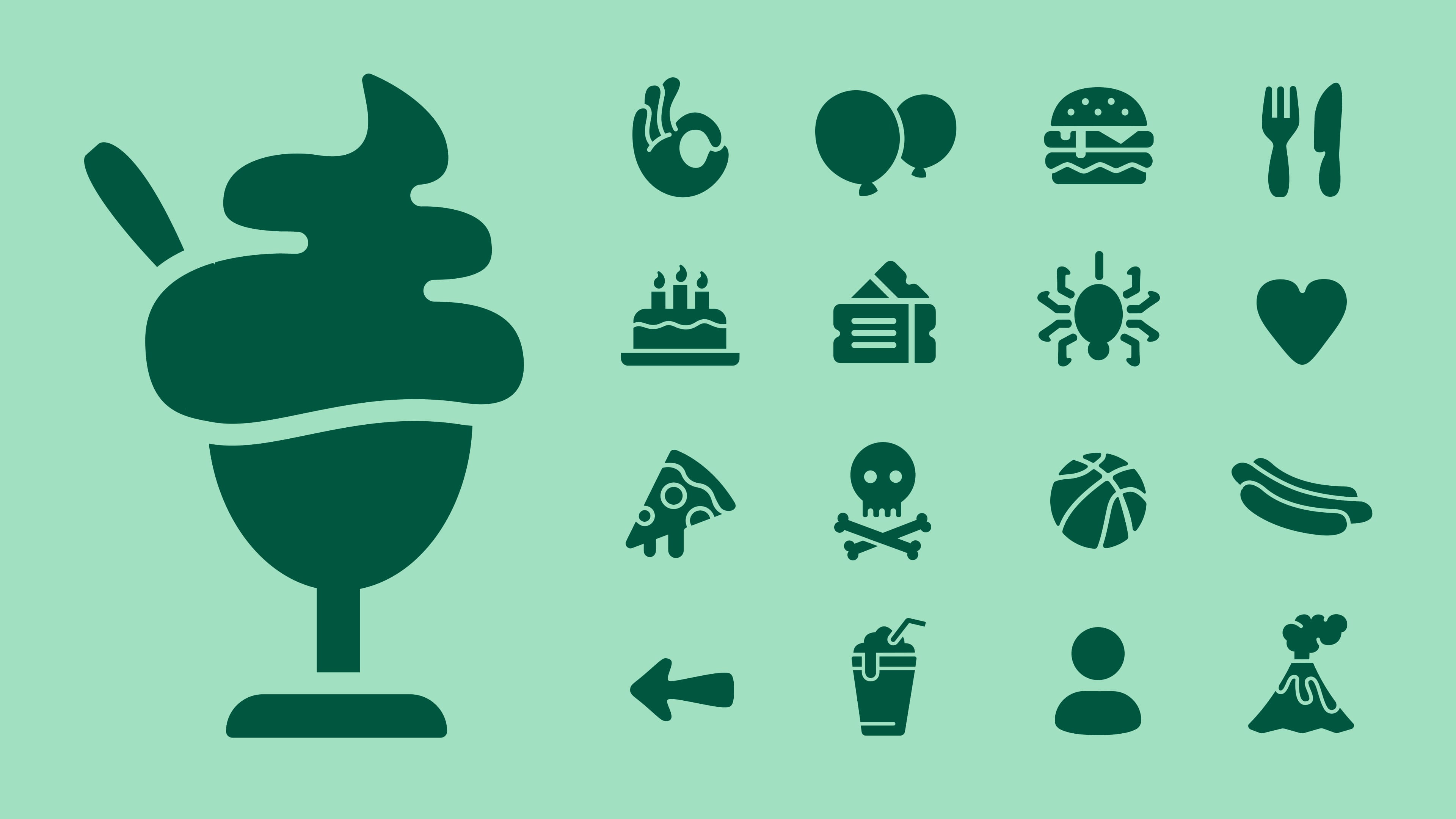
Examples of our icons
Icon style
When constructing new icons make sure to use a broad line and round shapes. Compare new icons to old ones to make sure it´s consistent.
EXAMPLE OF USAGE
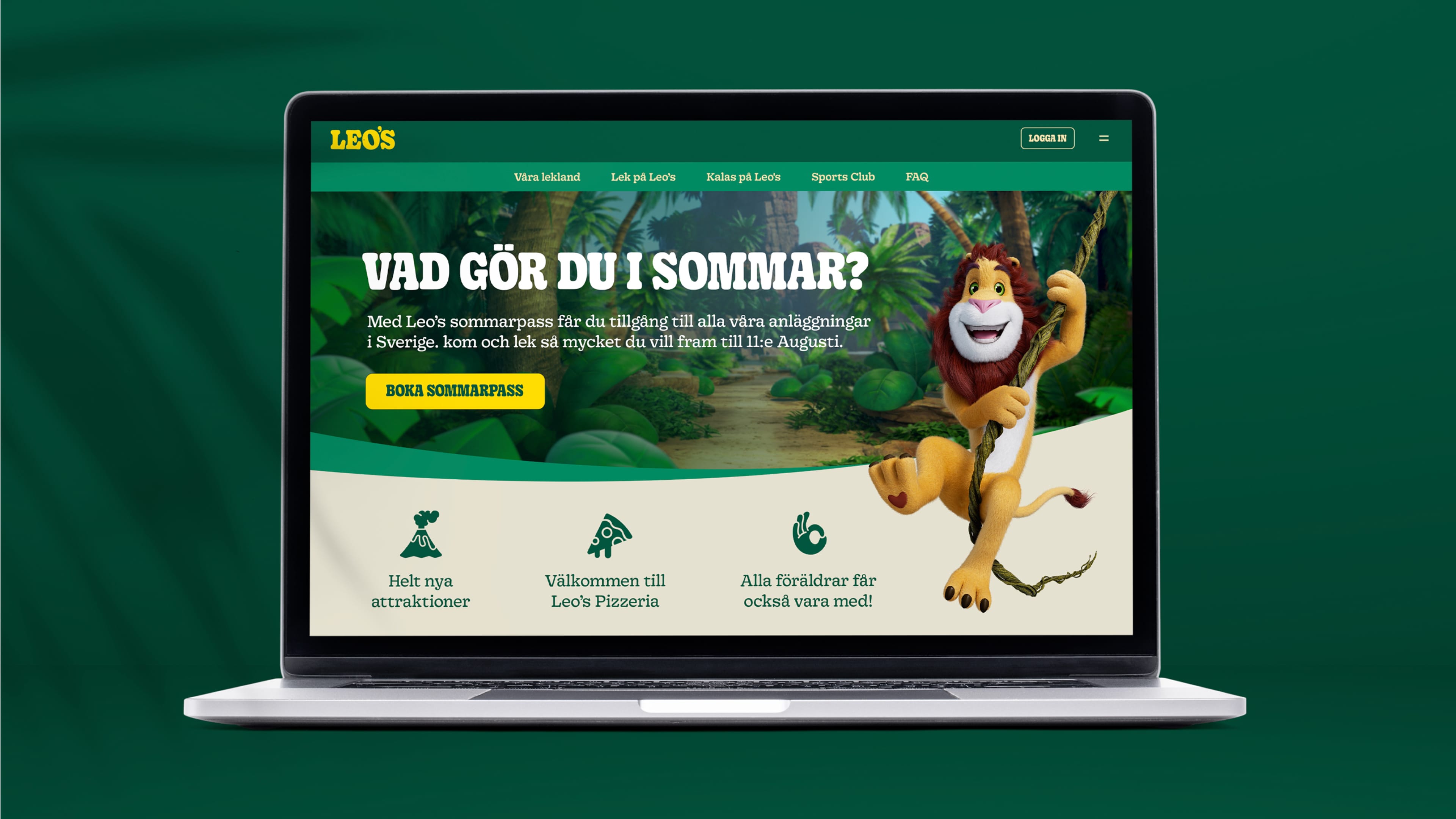
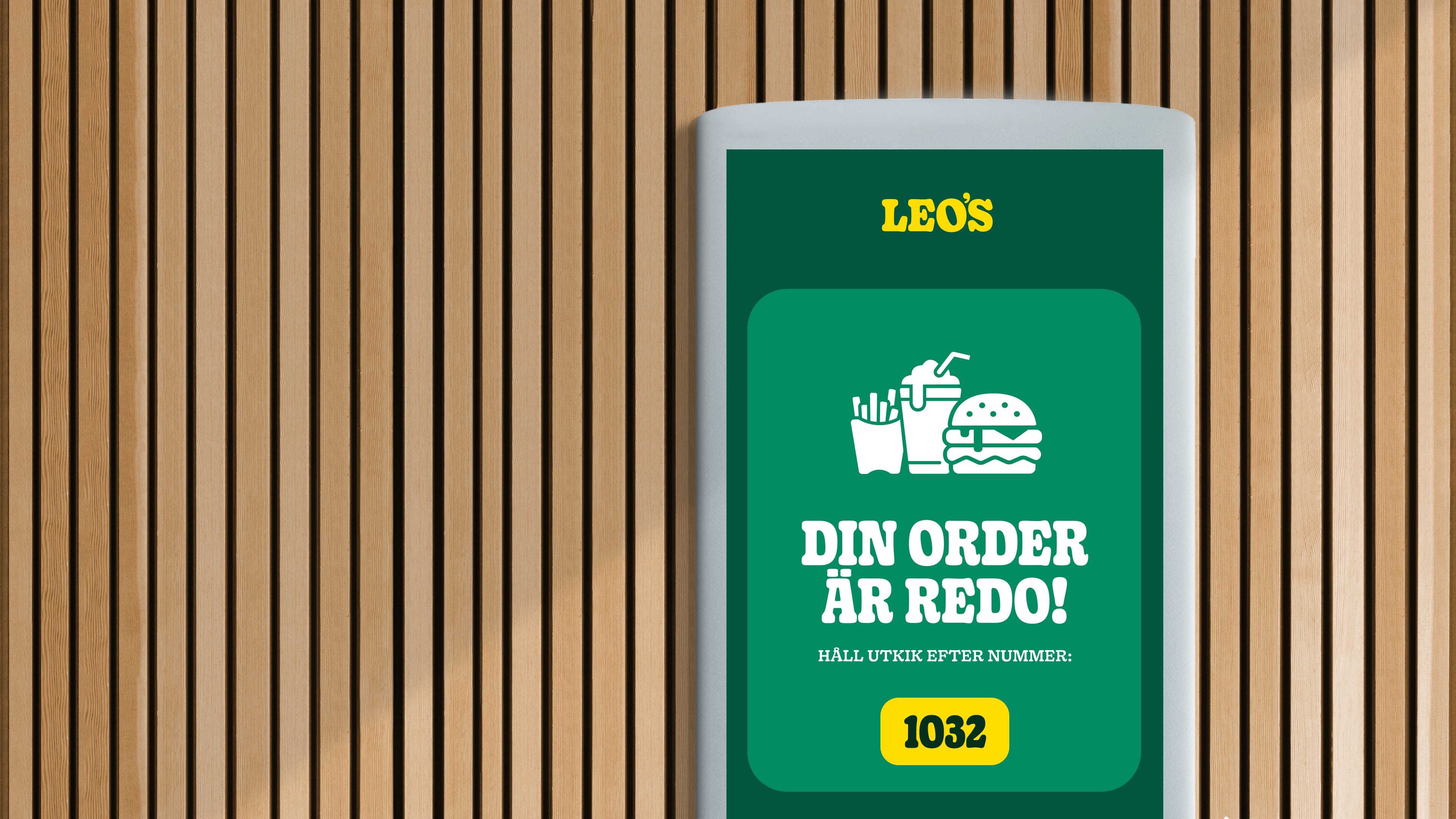
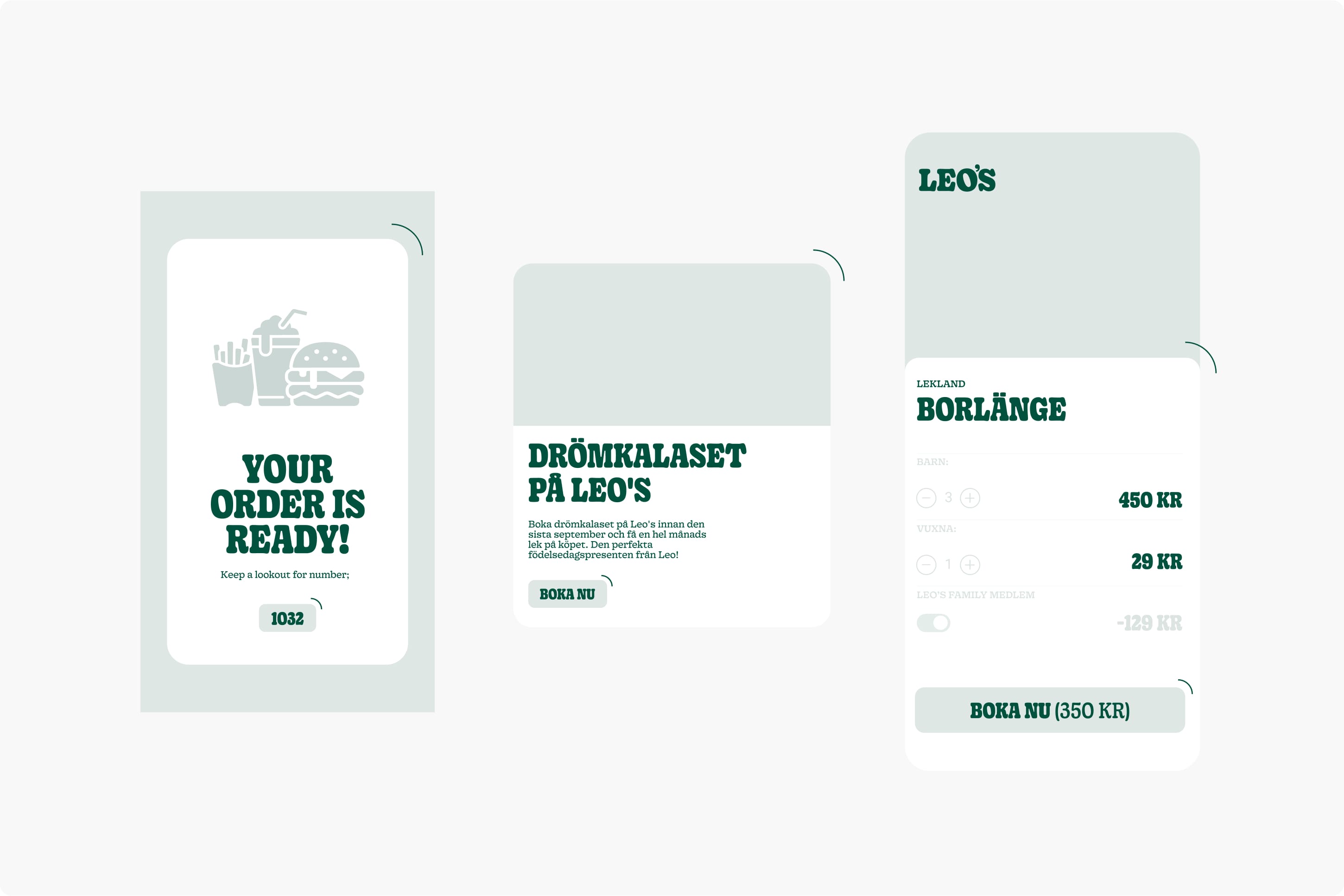
Icons are perfect for digital usage on webpages or in apps.
Icons can be used for internal promotions or wayfindings in bigger sizes.
GRAPHIC ELEMENTS
Our graphic elements can be used when we want to direct extra attention to something in our communication. For example sale on merchandise or free wifi.
Download GRAPHIC ELEMENTS (EPS)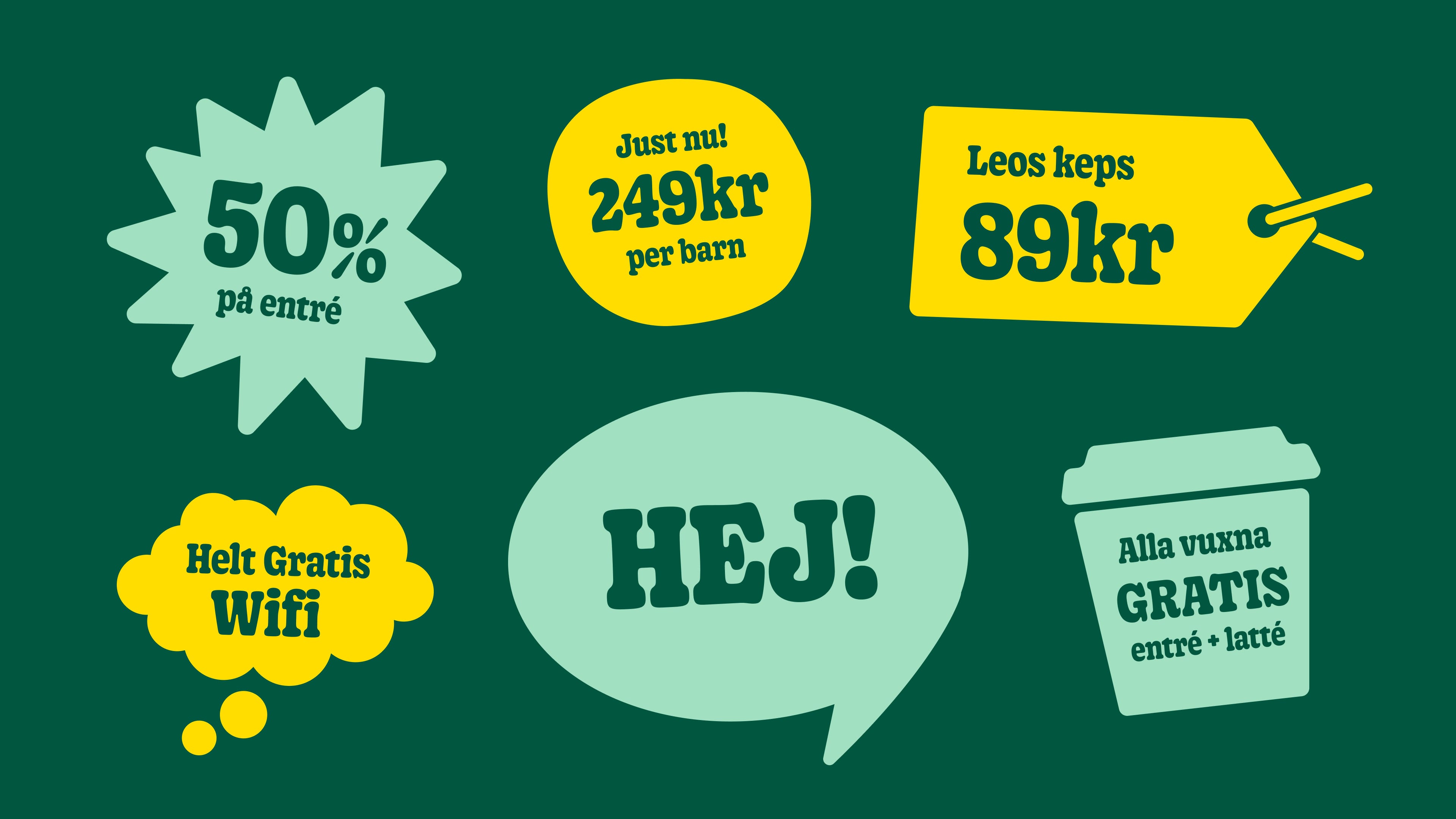
PATTERNS
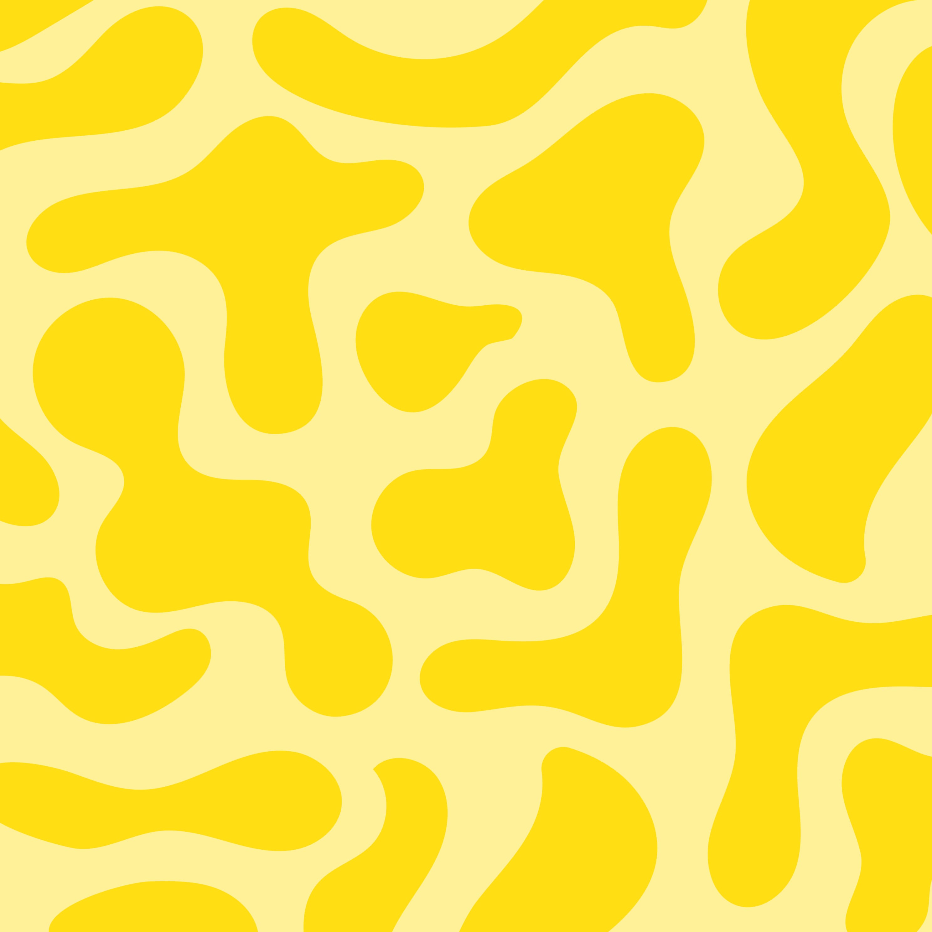
Our brand patterns—Funky Dots, Lava Fun, and Wonky Waves—are more than decorative elements. They’re extensions of our personality: playful, bold, and full of motion. Each pattern supports our visual storytelling, helping create memorable, immersive brand experiences across environments, packaging, digital, and more.
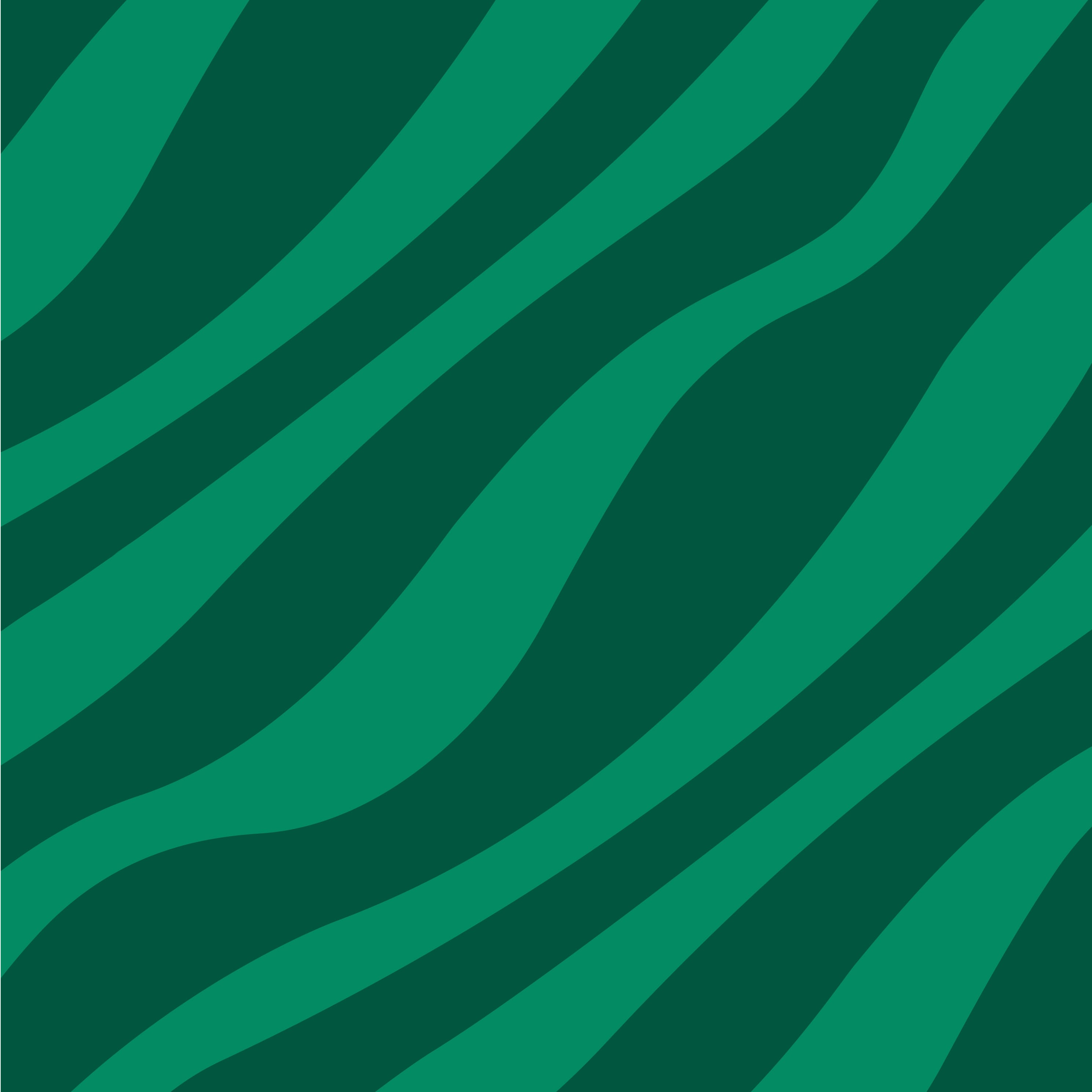
Wonky waves
Lava fun
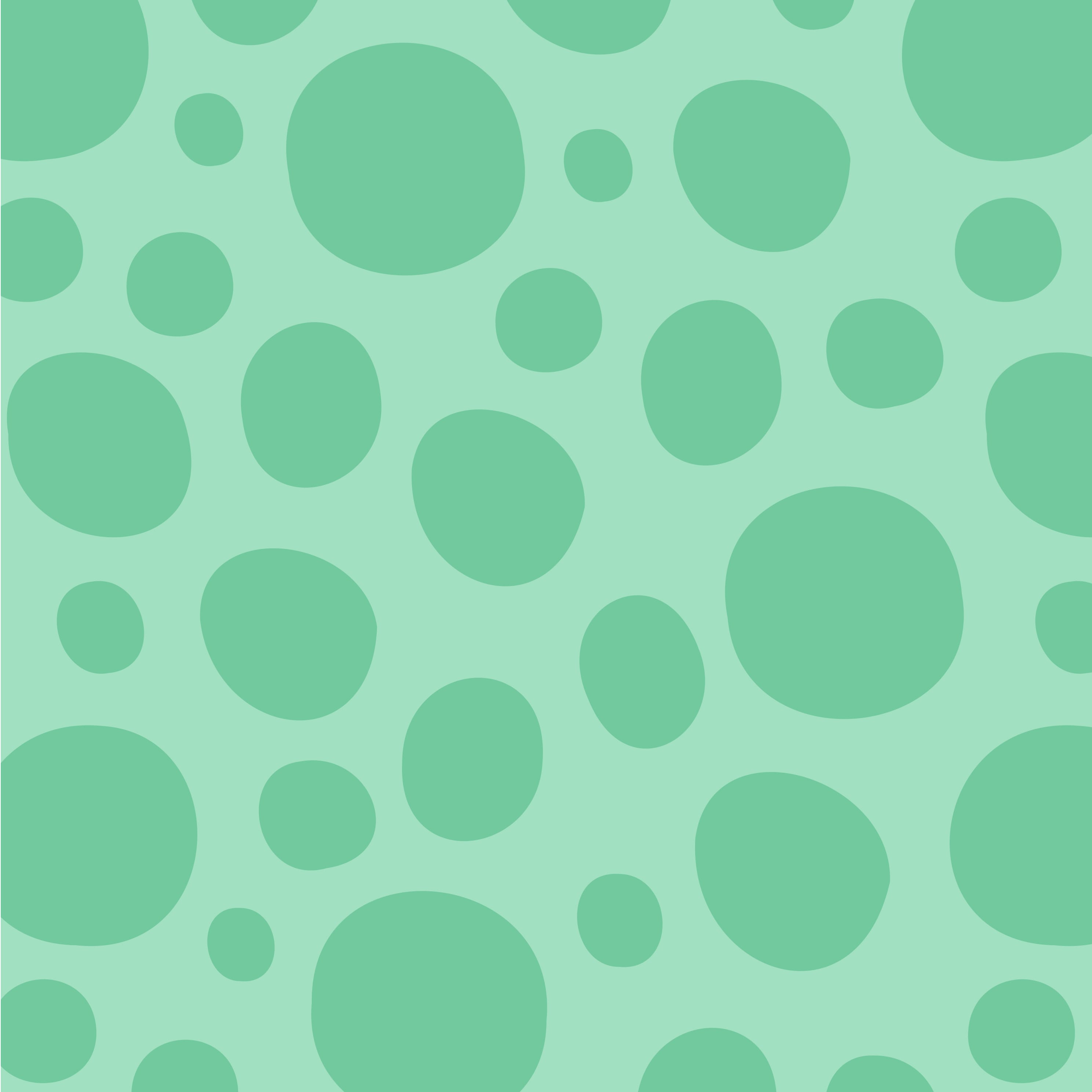
Funky dots
EXAMPLE OF USAGE
Each pattern is flexible in use and can be applied across a wide range of materials and touchpoints, both physical and digital.
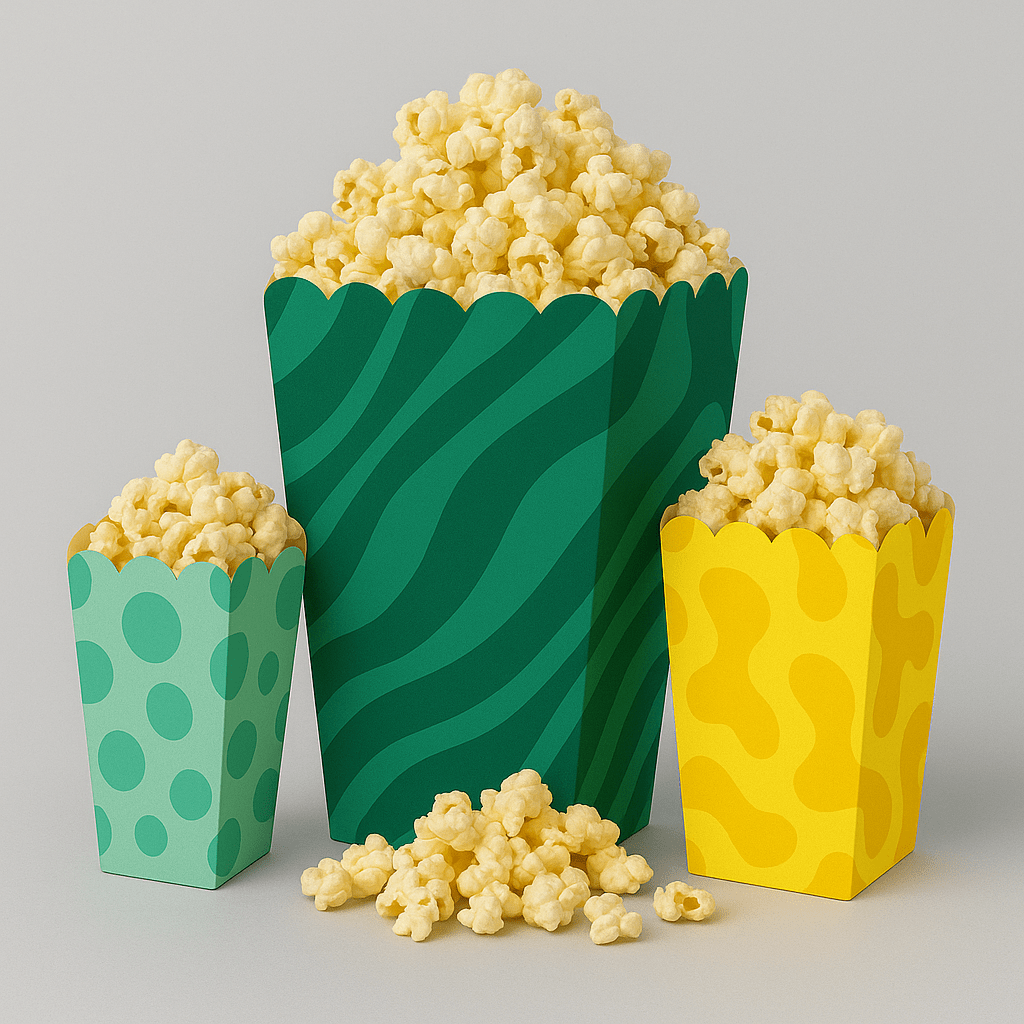
Example on packaging
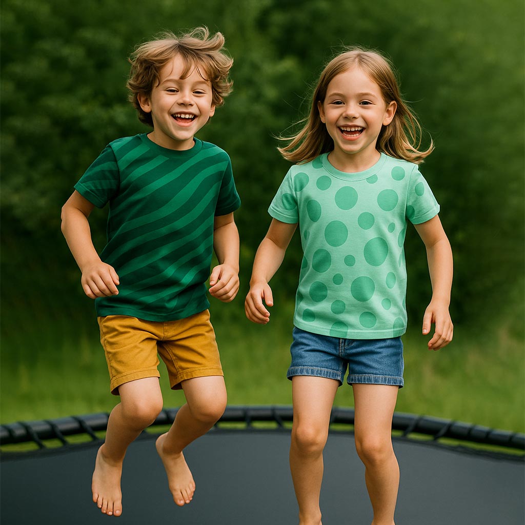
Example on clothing
UI ELEMENTS
In digital context, we apply rounded corners. This rounded and soft feel ties back to our other elements and helps create a uniform visual language.
Example on rounded elements
EXAMPLE OF USAGE