ABOUT US
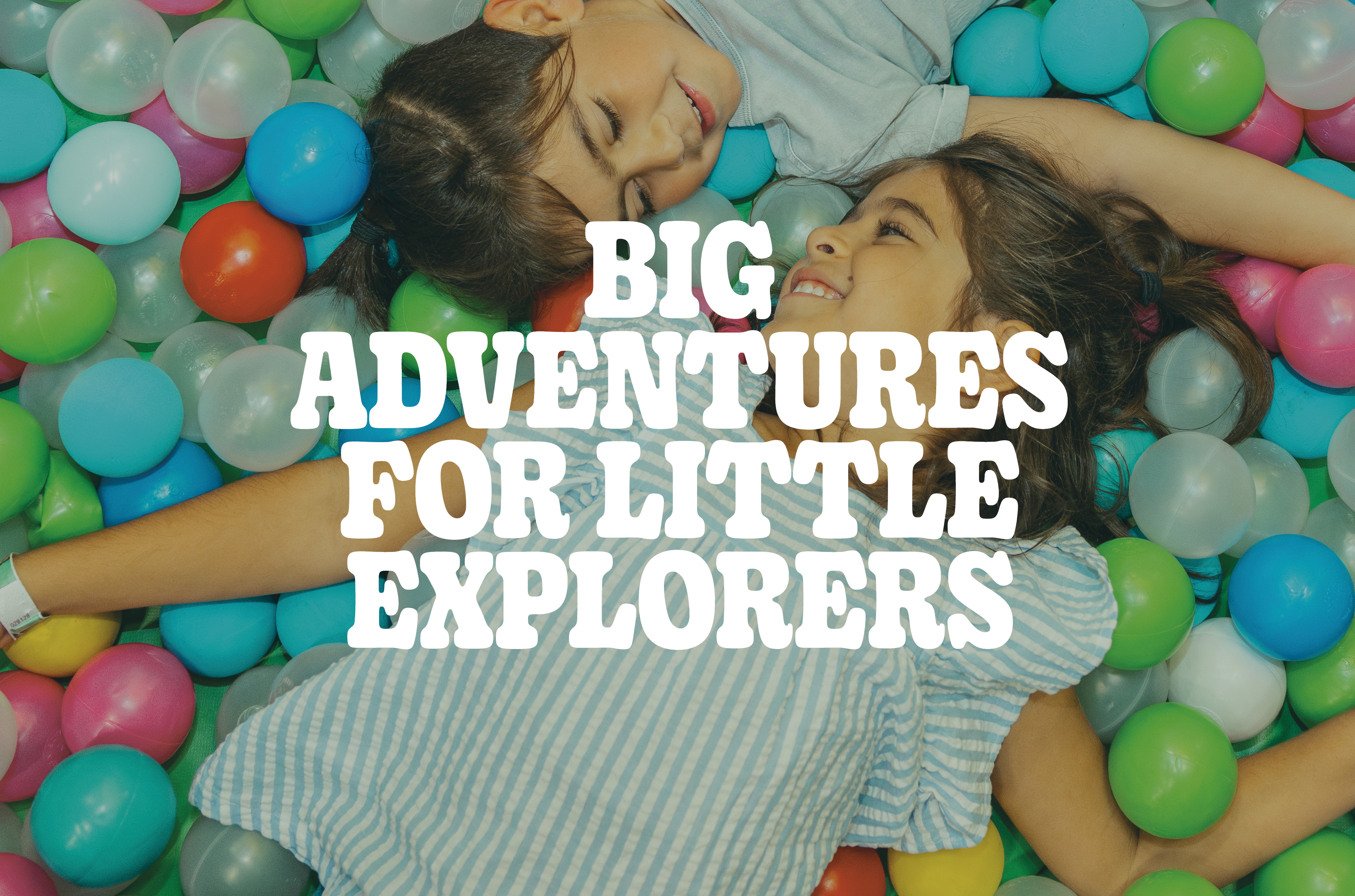
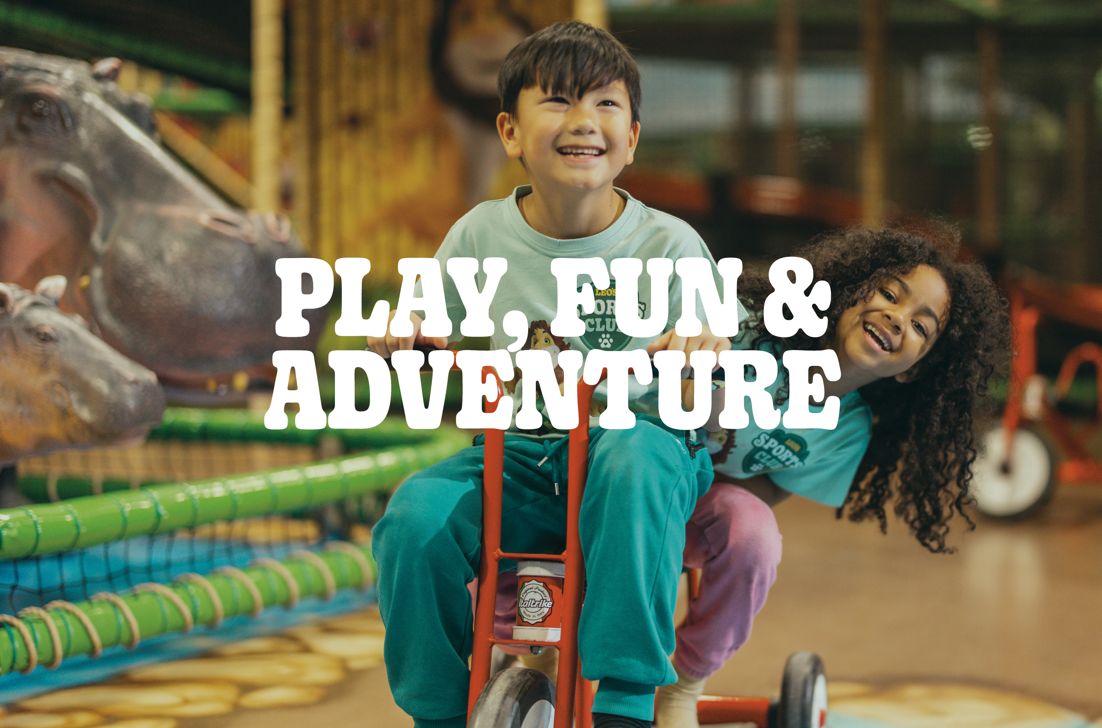
Leo’s gigantic play centers offer thousands of square meters of playarea and adventure for the whole family. Through our facilities, we aim not only to create a safe and clean play environment but also to inspire more movement and help children discover the joy of physical activity through play. A visit to Leo’s is an adventure for the whole family. When energy levels start to drop, stop by Leo’s Bistro, where you’ll find a wide selection of fresh food. We also host fantastic birthday parties. In addition to ensuring our guests have fun, our top priorities are always service, safety, and cleanliness. Our vision is to be the best indoor play center chain in the world. To achieve this goal, we do everything with quality and enthusiasm.
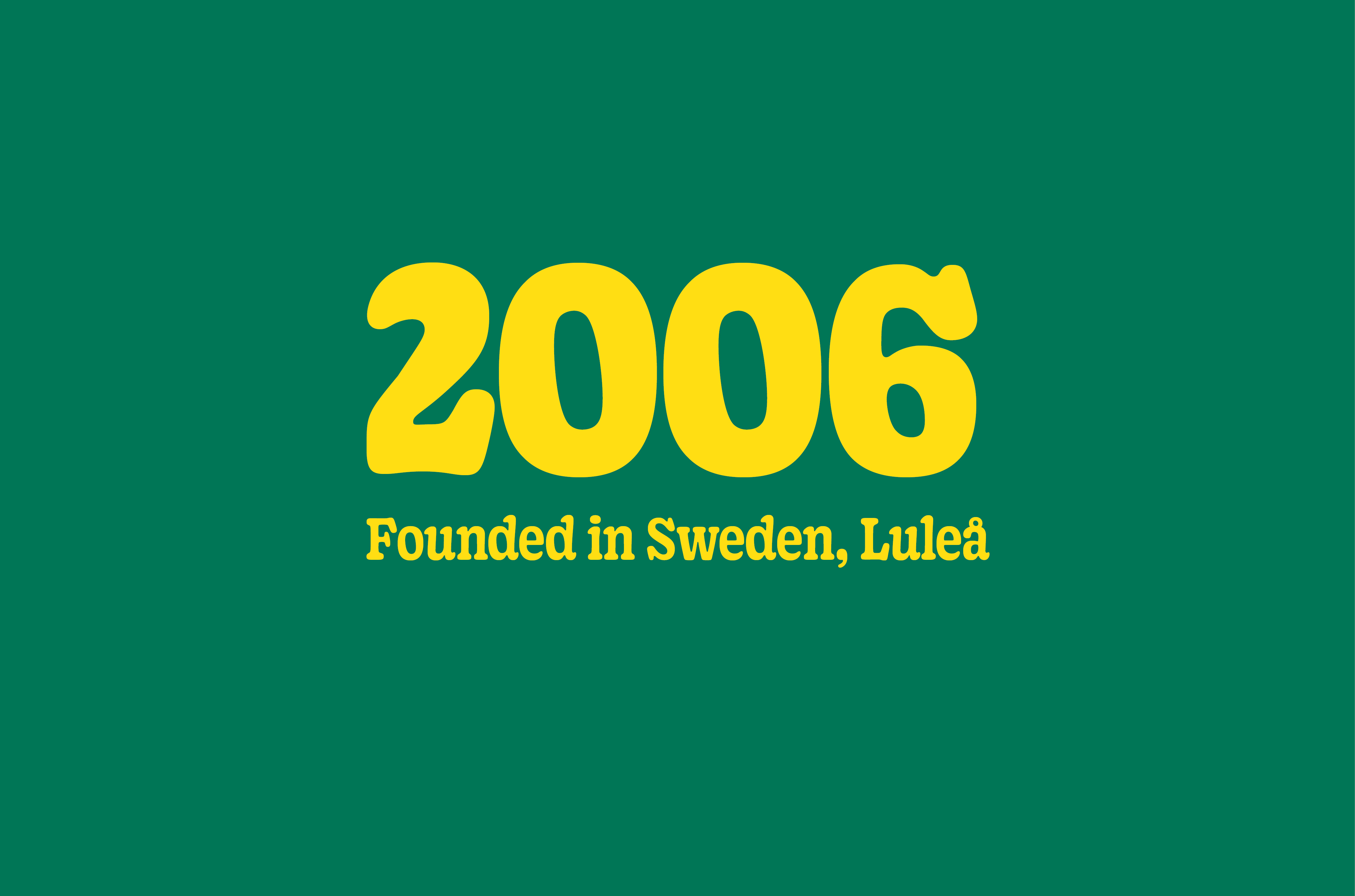
Leo’s was founded in 2006 in Luleå, Sweden, and is the largest and most popular indoor play center chain in the Nordics.
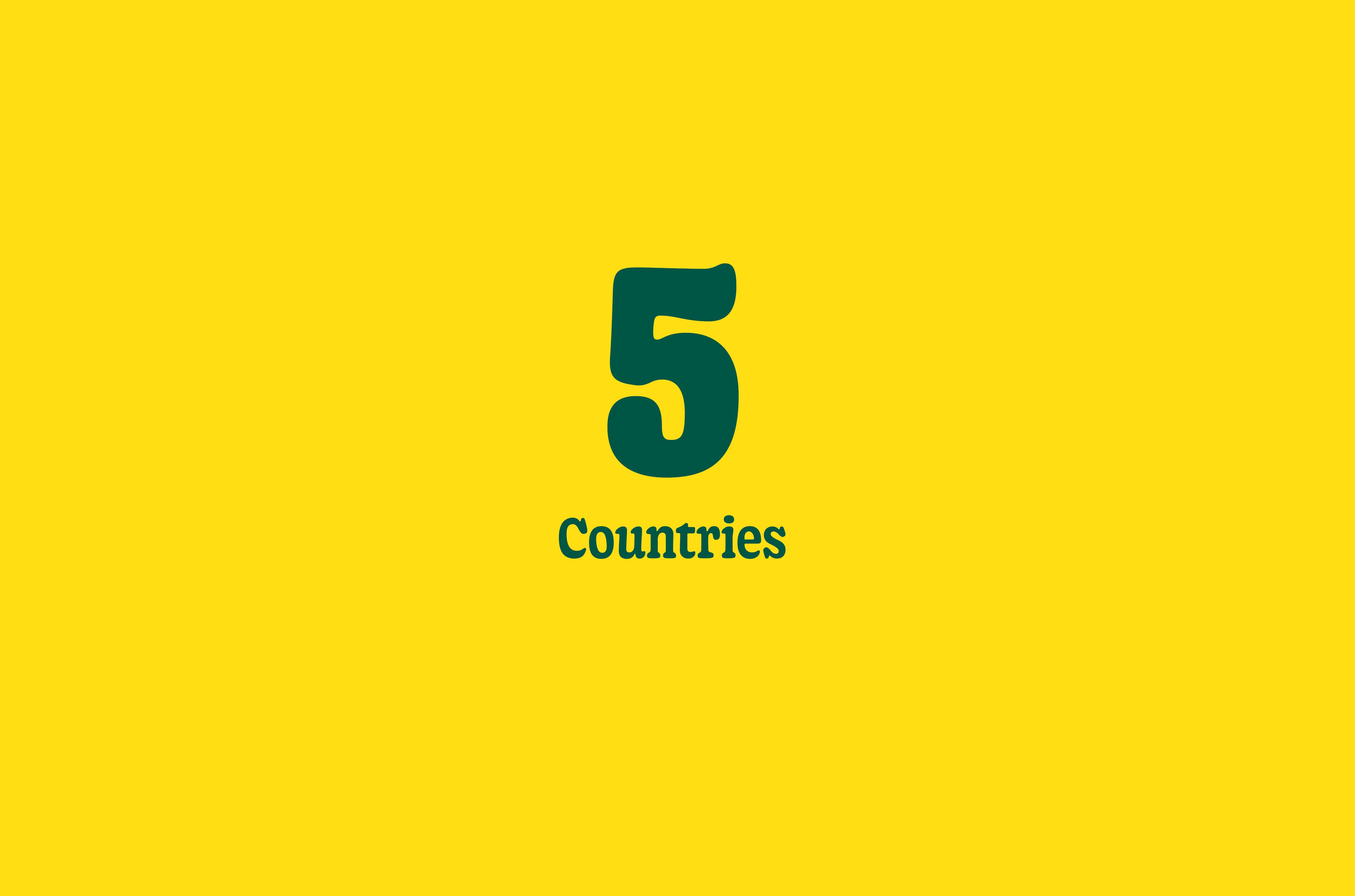
63 play centers (in Sweden, Norway, Denmark, Finland, and Germany). The company is in an expansive phase and expects to open new centers every year.
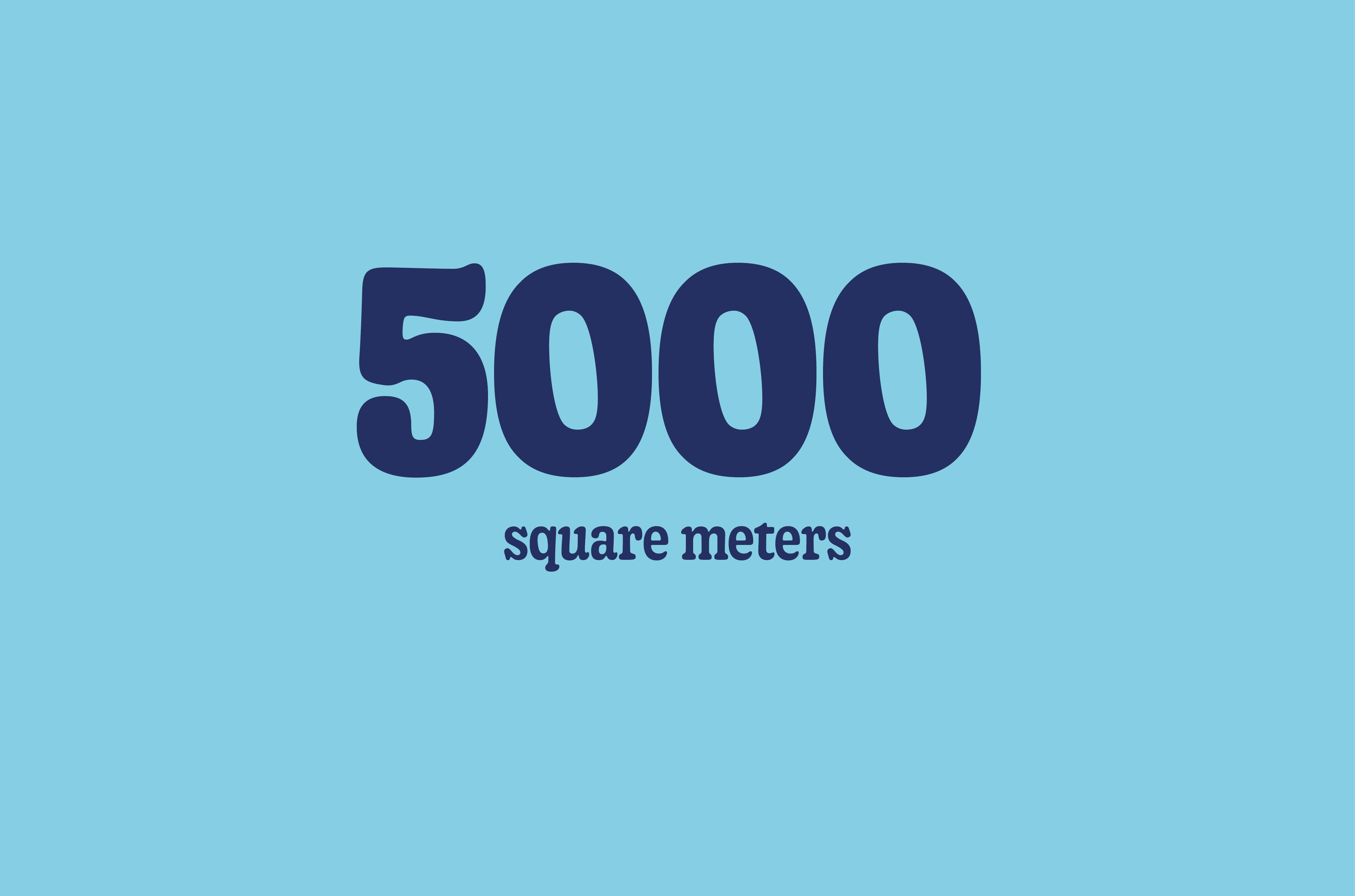
The play centers are 3,500–5,000 square meters, filled with trampolines, ball pits, sports arenas, and much more.
At Leo’s, we look for superheroes who believe in the power of play and have a burning passion for creating joy and memories for families while getting kids moving.
BRAND ESSENCE
The heart and soul of the brand - Leo’s brand essence captures what the brand stands for in one short, powerful statement. It captures its core identity, emotional appeal and unique value in just a few words.
Evokes discovery, excitement, and the child-focused experience.
Primary use of Logotype - Yellow on deep jungle green
BRAND PURPOSE
Why We Exist - It’s about the positive impact the brand wants to create in people’s lives or in the world. For Leo's its to inspire a generation of healthier, happier, and more confident kids by getting them moving through the power of play.

To inspire parents and their children to move and play together.
Primary use of Logotype - Yellow on deep jungle green
Vision
Where we're going - At Leo’s, we believe that every child deserves the freedom to move, play, and express themselves with joy. Our vision — active and happy kids — drives everything we do. It’s about more than just playtime; it’s about supporting healthy development through movement, laughter, and imagination. By championing movement and happiness, we aim to make a lasting difference in every child’s day — and in their growth, confidence, and overall well-being.
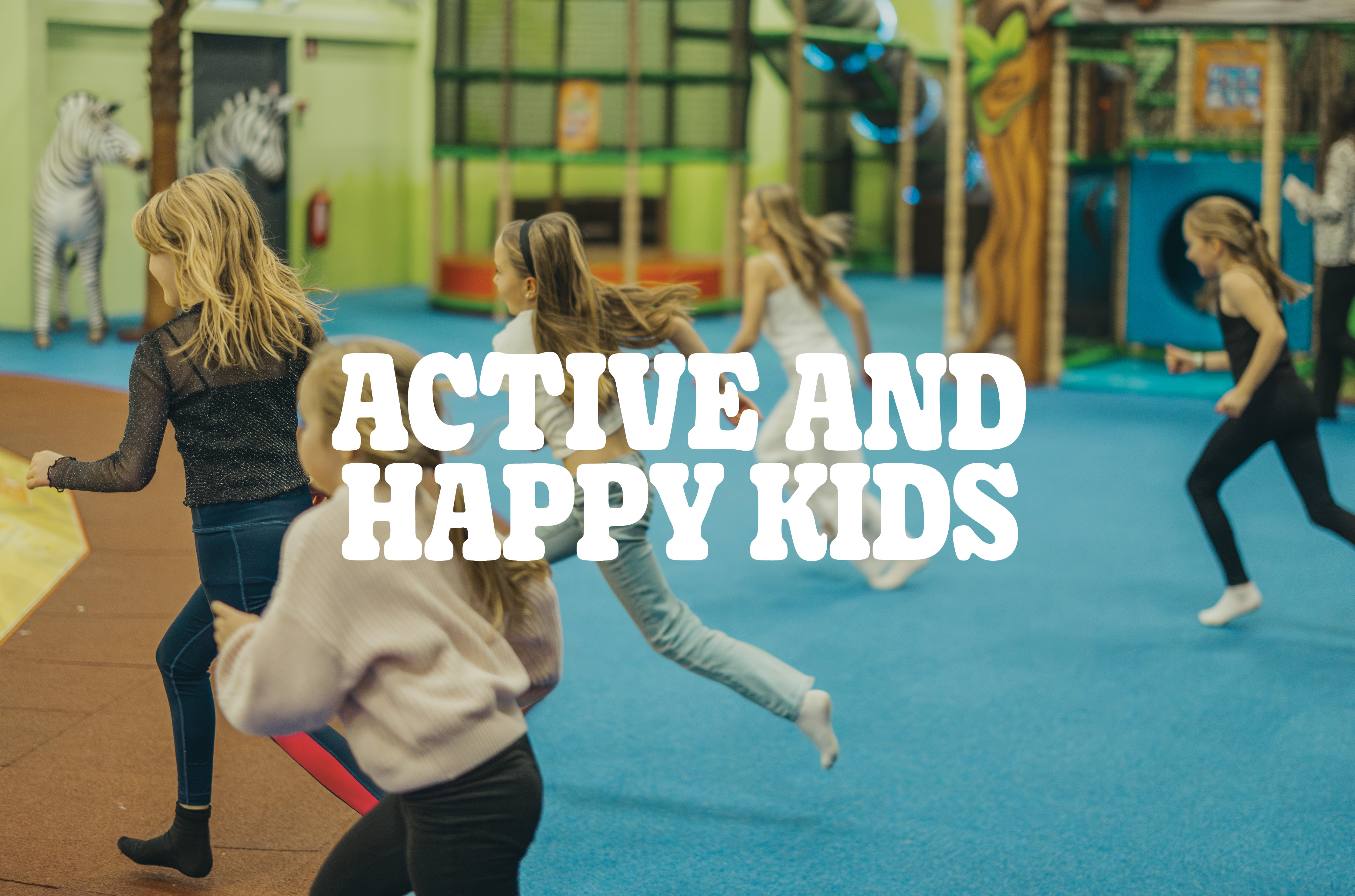
We believe that movement sparks joy, and joy helps children grow. At Leo’s, every child should feel free to move, play, laugh — and just be themselves.
Primary use of Logotype - Yellow on deep jungle green
MISSION
What we do - We make space for children’s joy of movement, imagination, and connection. Through play, activity, and care, we create environments that support kids’ confidence and happiness and focuses on motoric development – together with their families and friends.
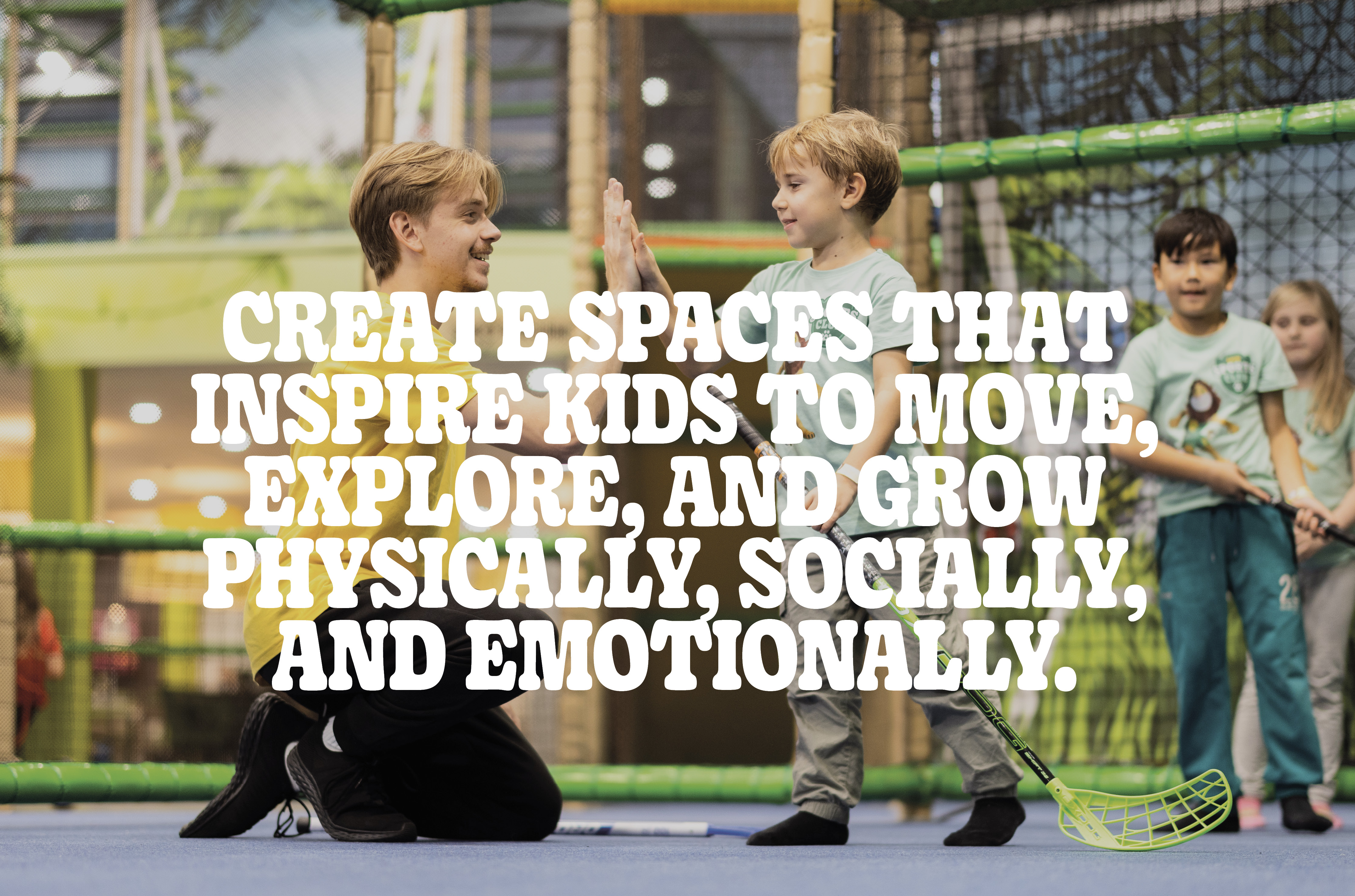
We design and deliver play-based experiences and environments that encourage kids to move, explore, and grow.
Primary use of Logotype - Yellow on deep jungle green
BRAND VALUES
Core beliefes and guiding actions - Leo’s brand values are the foundation of everything we do – from the way we design our spaces to how we interact with kids and their families. They bring our vision of “active and happy kids” to life in a clear, tangible way.
Movement is at the core of our philosophy. We believe that when kids are active through play, they grow – physically, emotionally, and socially.

Joy fuels every experience at Leo’s. We aim to make every visit filled with smiles, laughter, and exitment.
Imagination sparks creativity and learning. We create spaces and moments that encourage kids to dream, invent, and explore new adventures.
Togetherness makes the experience meaningful. Leo’s is a shared space for connection – between children, families, and communities.
PAYOFF
Our brand promise is the commitment our brand makes to our customers about what they can consistently expect from every interaction with the brand. It’s the experience we guarantee to deliver — every time.
We promise to create parks filled with play, where every moment revolves around having fun and the freedom to explore the next adventure.
Primary use of Logotype - Yellow on deep jungle green
TARGET audience
Knowing Leo’s target audience is essential for building an effective brand comunication. The core target audience is the specific group of people our messages is meant to reach. These are the people who are most likely to care about what we offer, benefit from it, and take action. For Leo's it is both the children and their parents that are the core audience, both with differnet roles in the decision making process.
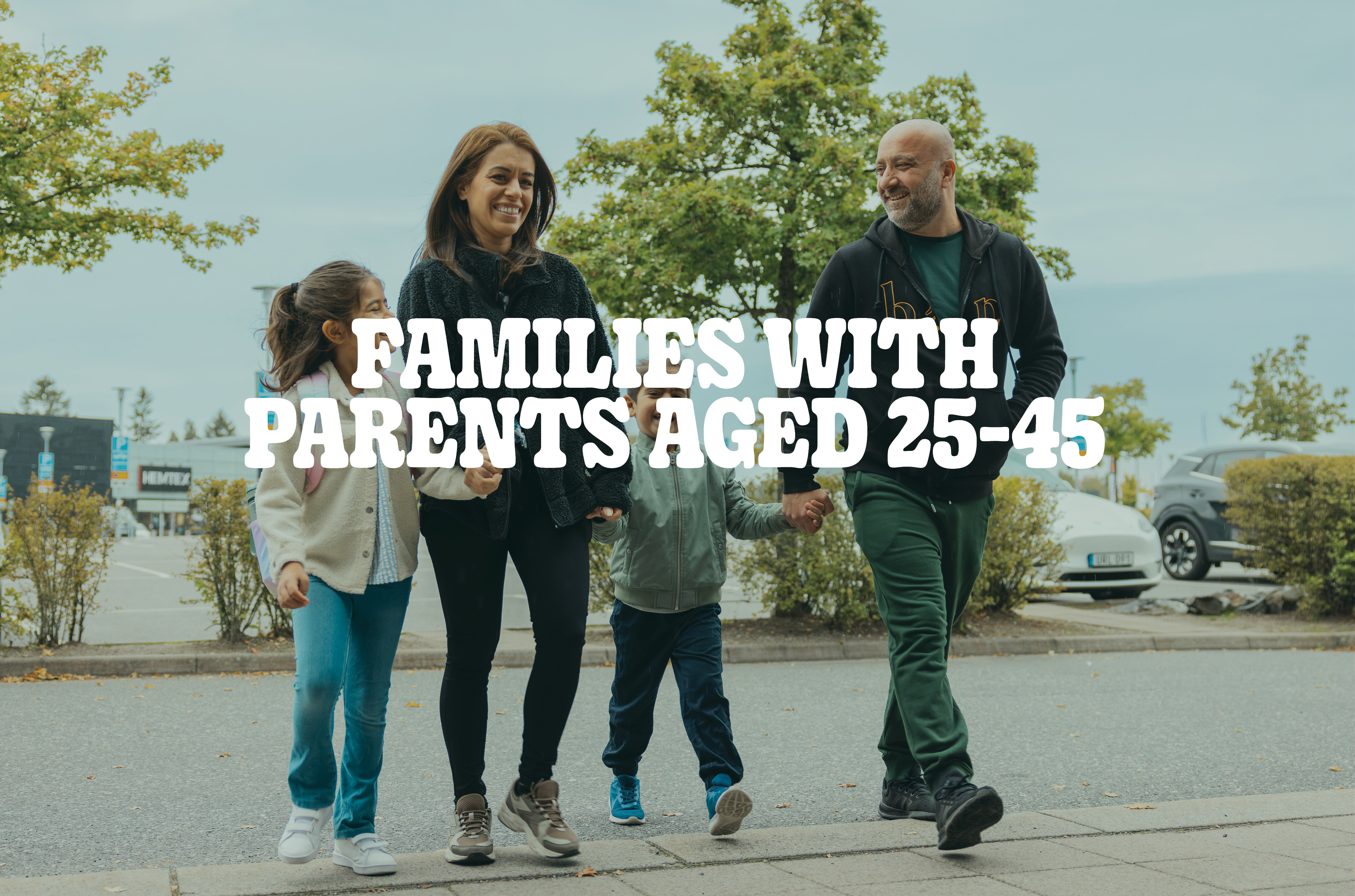
Modern families led by parents in their 20, 30 and 40 – often busy, digitally savvy, and seeking meaningful, high-quality experiences for their children. They value safety, fun, and development, and look for brands that align with their lifestyle, support active play, and offer shared moments of joy. These parents appreciate convenience, trustworthiness, and brands that genuinely care about their children’s well-being.
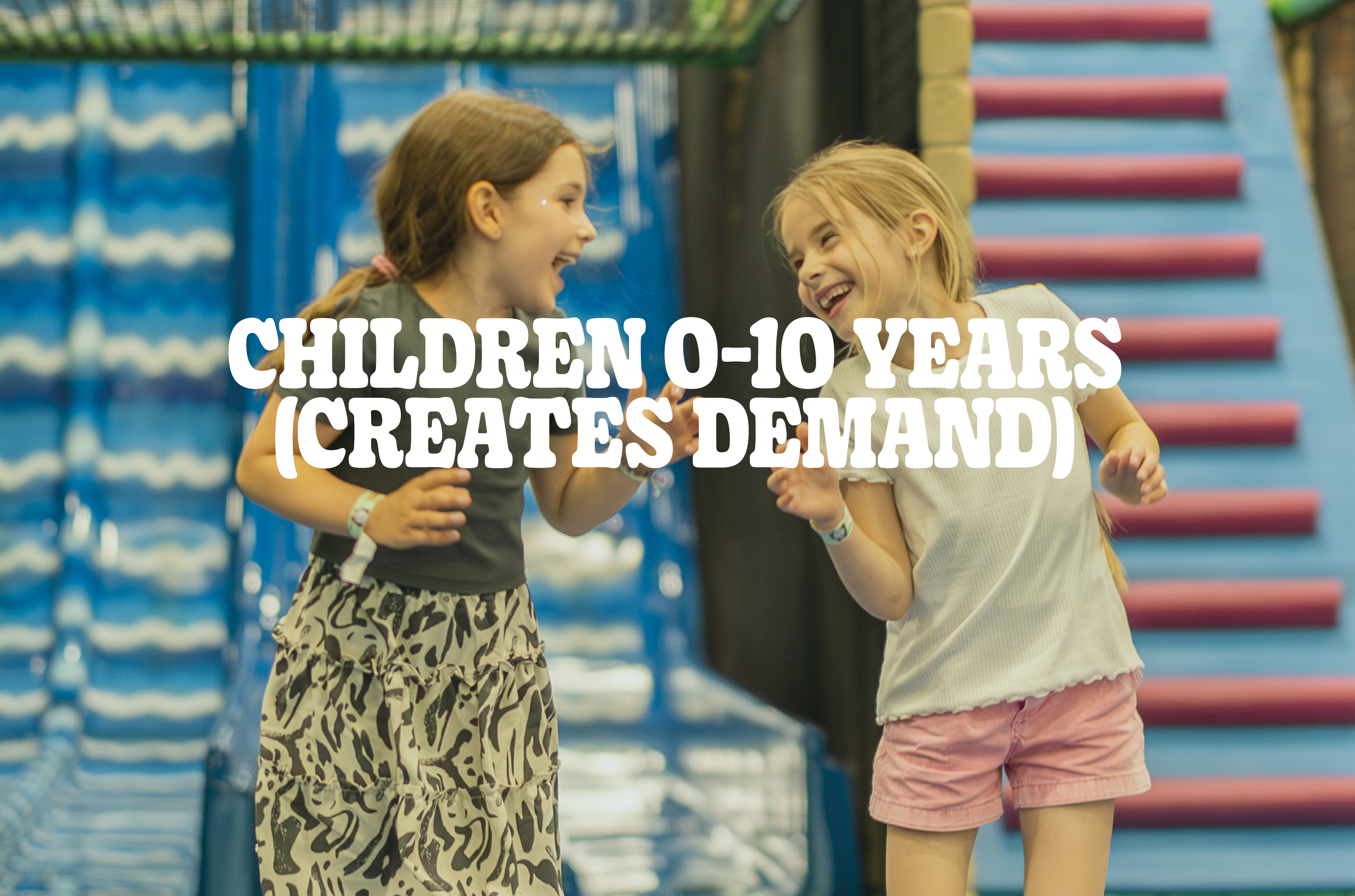
Curious, energetic, and imaginative – children aged 0 to 10 are at the heart of Leo’s world. They seek excitement, play, and freedom to explore. Their preferences, passions, and emotional reactions strongly influence family decisions. If it’s fun, active, and engaging, they’ll ask for it again and again – making them the true drivers of demand in the family.
TONE OF VOICE
Leo’s speaks with joy and energy, always encouraging movement, imagination, and fun. The tone is friendly and accessible, never condescending or overly polished. We talk to kids at their level, and to parents with warmth, clarity, and confidence.
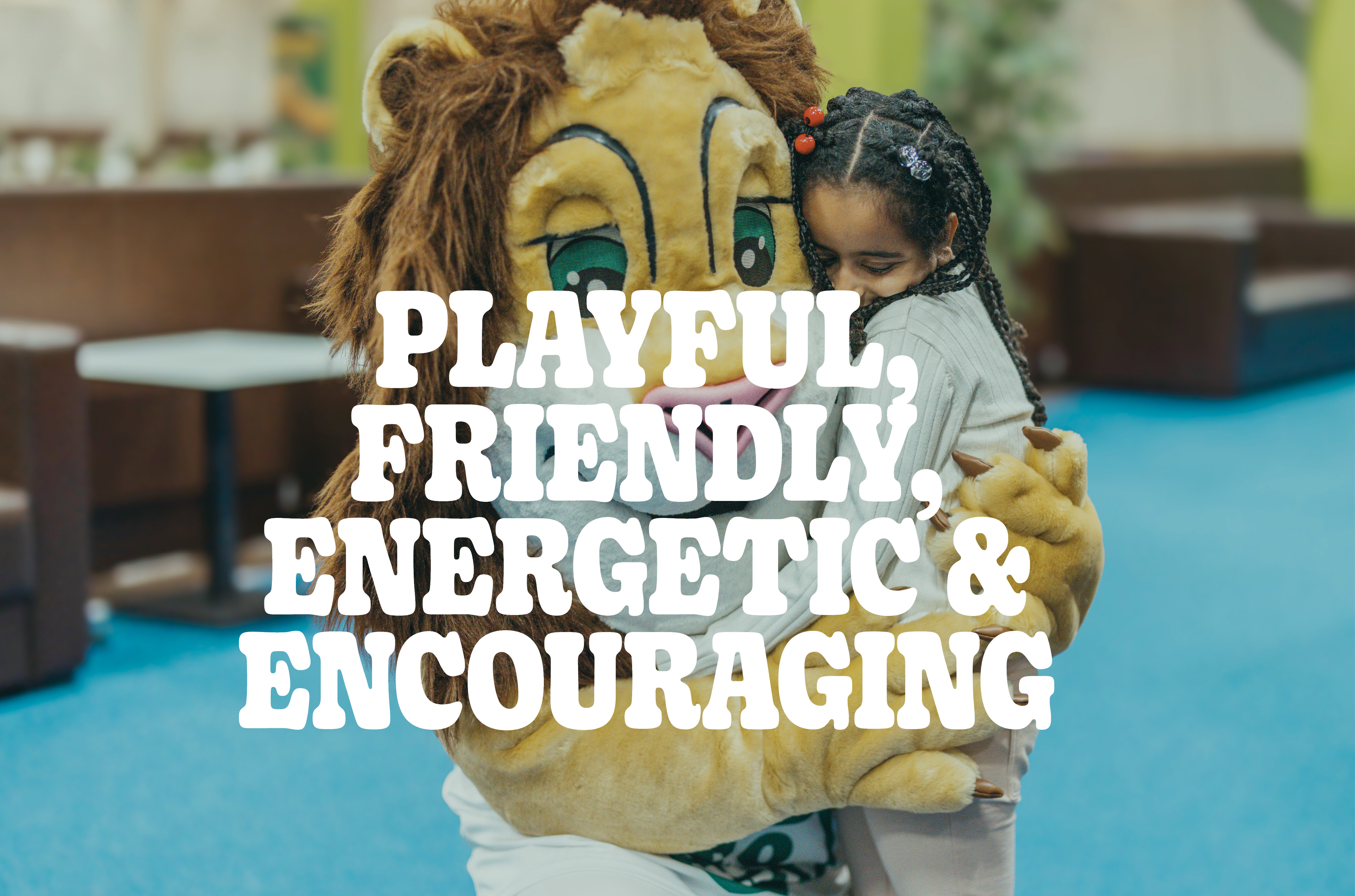
Playful, friendly, energetic, and encouraging – with a child’s curiosity and a parent’s trust.
Primary use of Logotype - Yellow on deep jungle green
brand identity
Our brand toolbox - Brand identity is the face and voice of our brand. It helps people recognize us, trust us, and connect emotionally with what we offer. It’s the collection of elements that our company uses to present itself to the world and communicate its personality, values, and purpose. It’s how our brand looks, sounds, and feels. In this model we use 6 different categories. Each with a few key words or frases to define the core of Leo's brand identity.
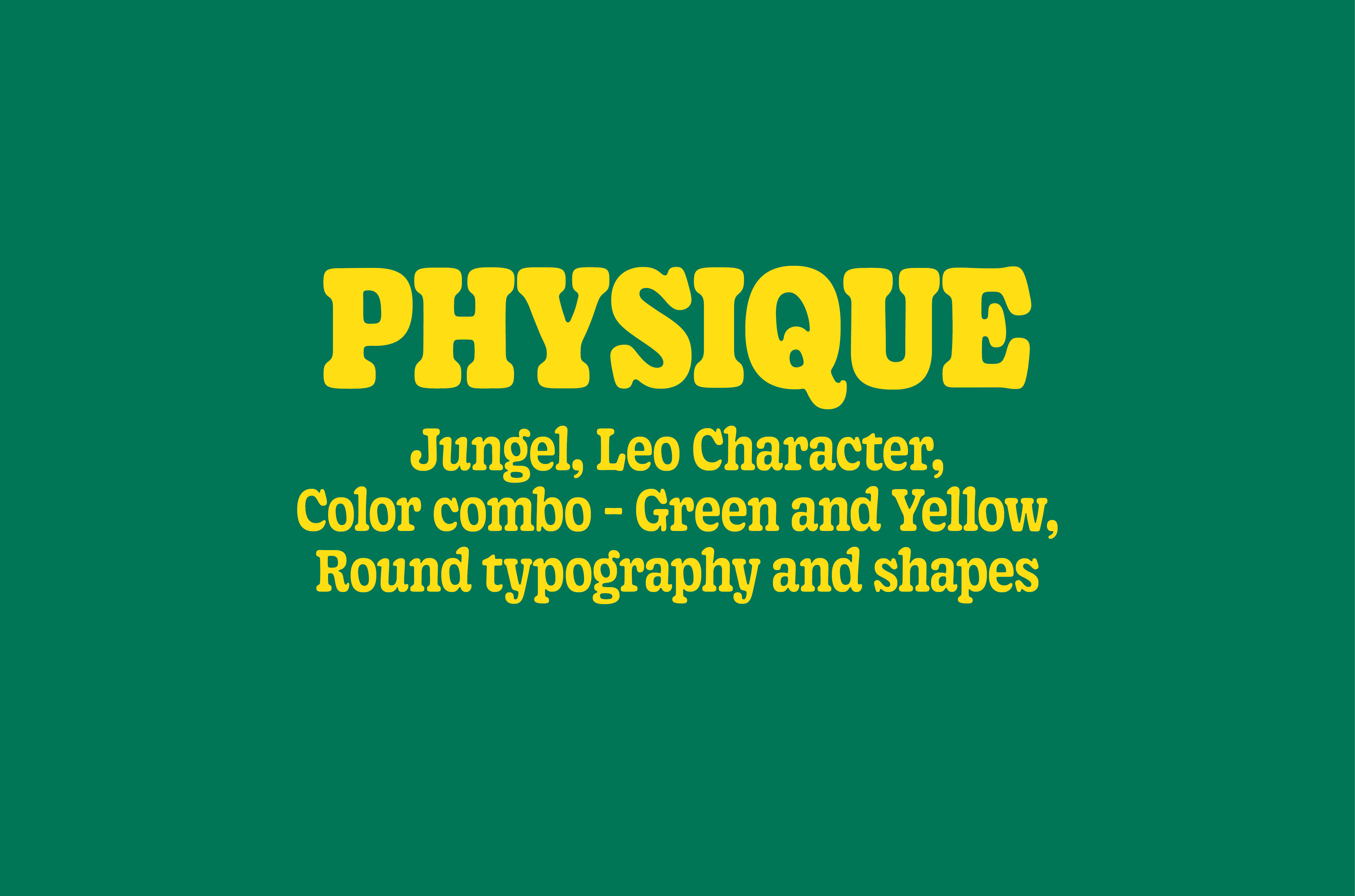
Physique focuses on the visual aspects of the brand. The key elements are what makes us recognizable.
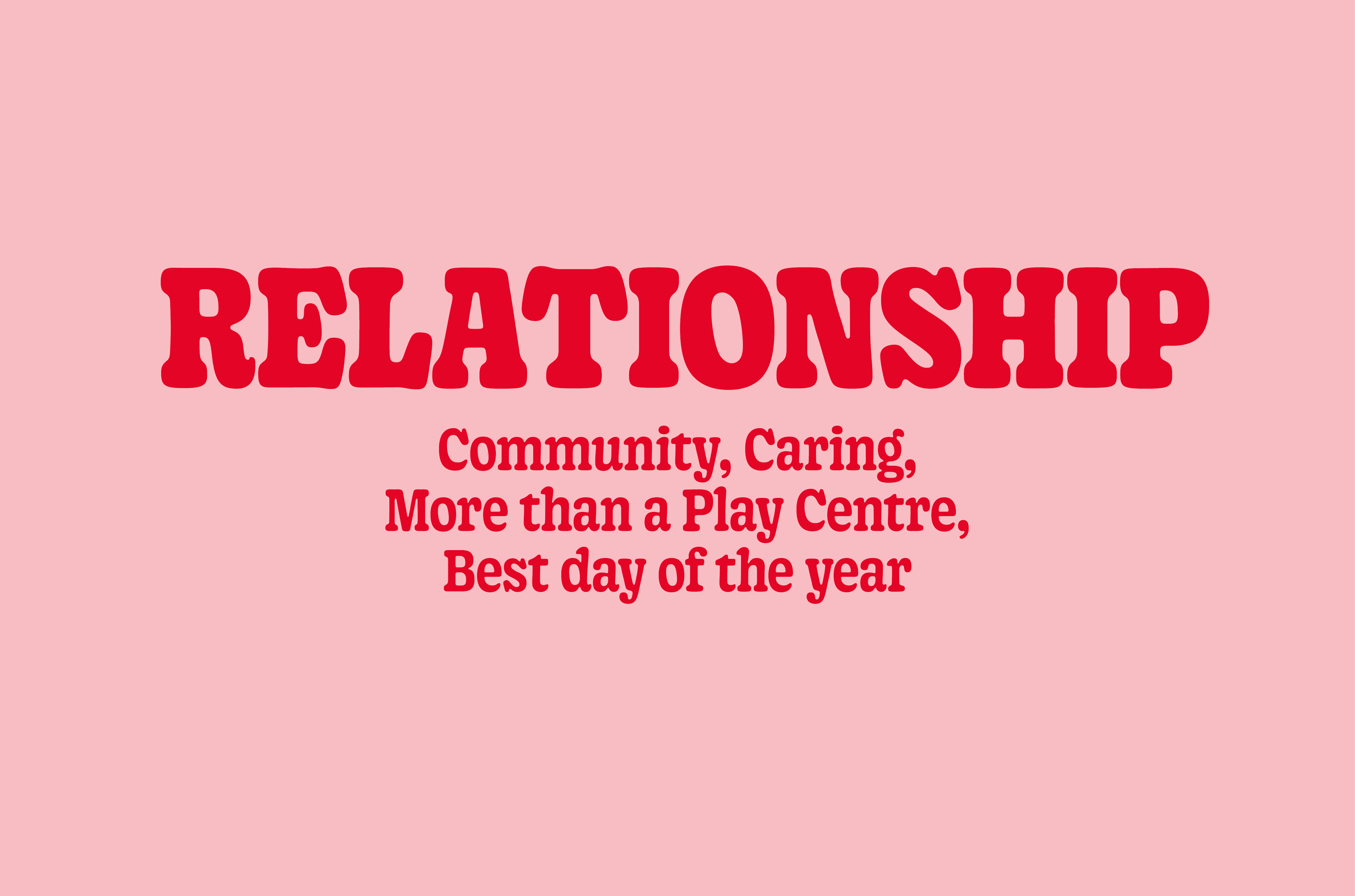
Relationship tells us of the emotional connection our target audience have to our brand. How they feel before, during and after a visit.
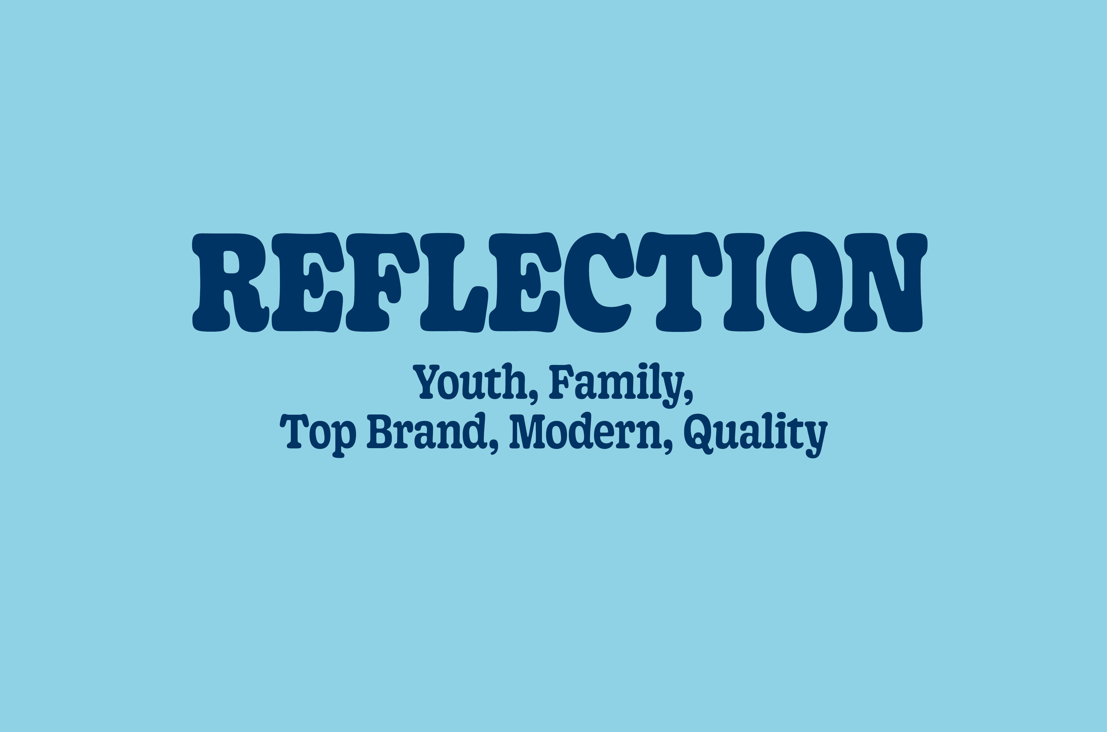
Reflection describes what we want the brand to reflect. Leo's is the leading play center brand. We set the standard for what a play center is.
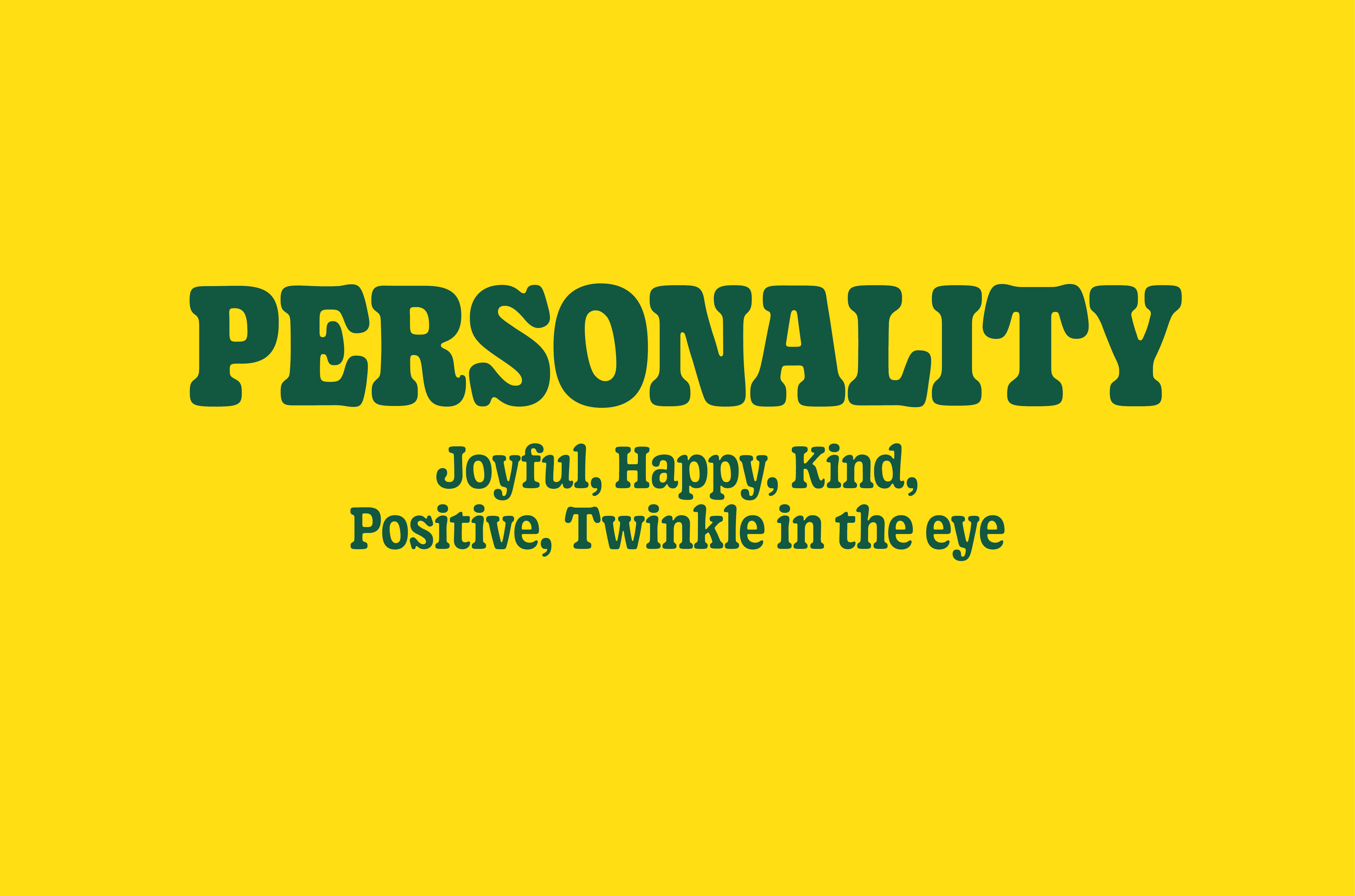
Personality describes how we interact and what we sound like.
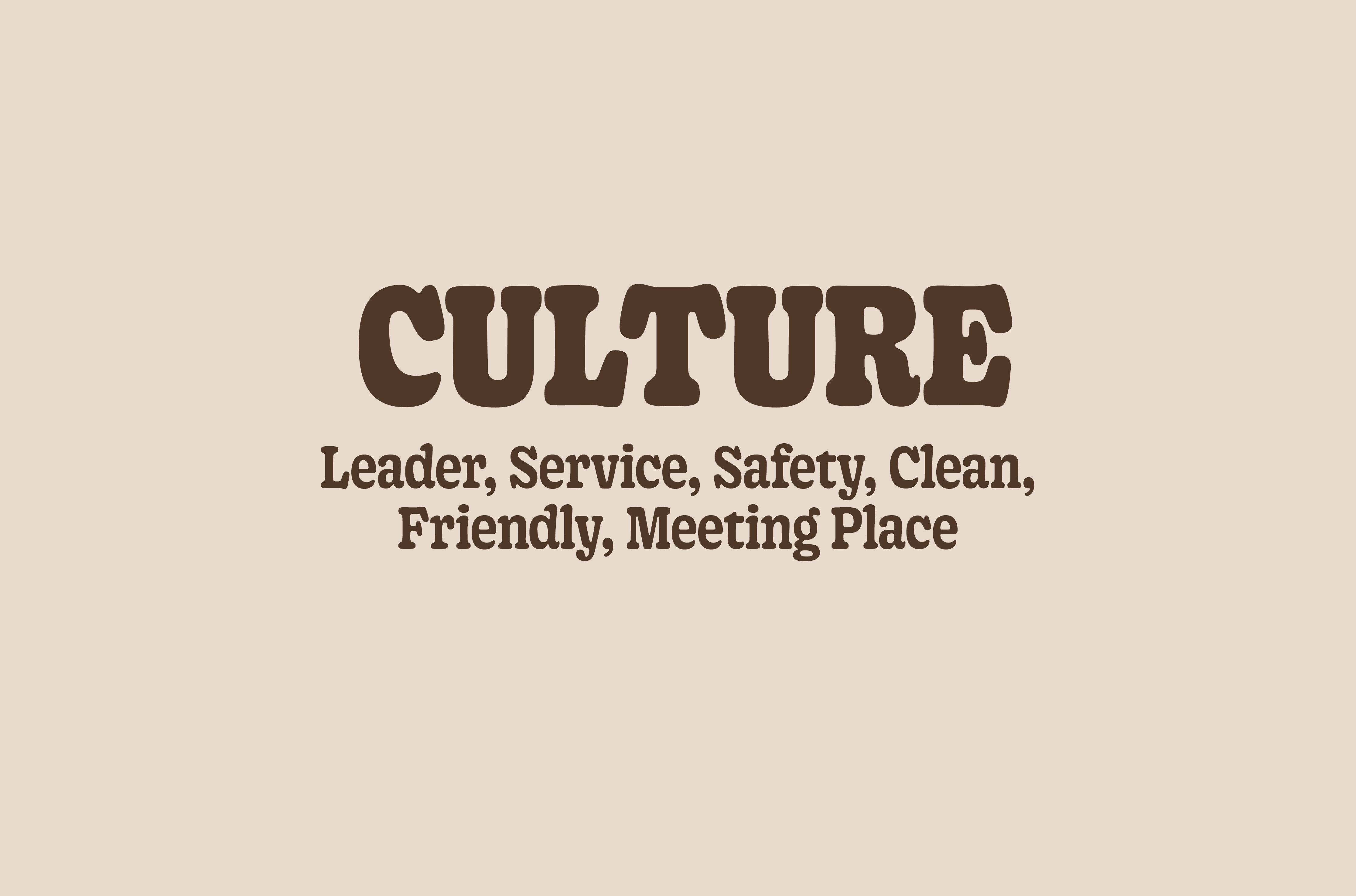
Culture captures the connection to the experience and the values that the brand stands for.
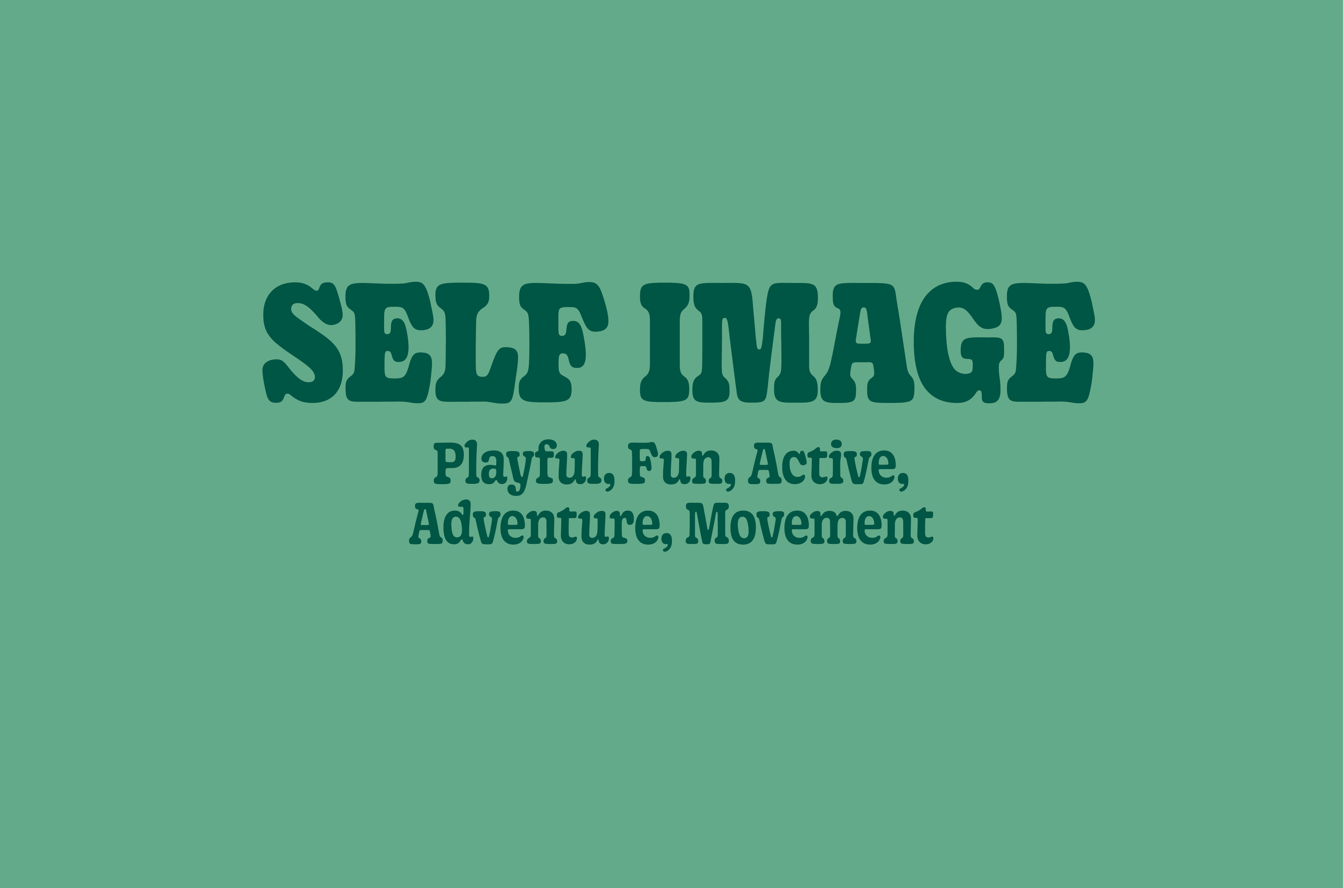
Self Image tells us how we want our target group to percive us.